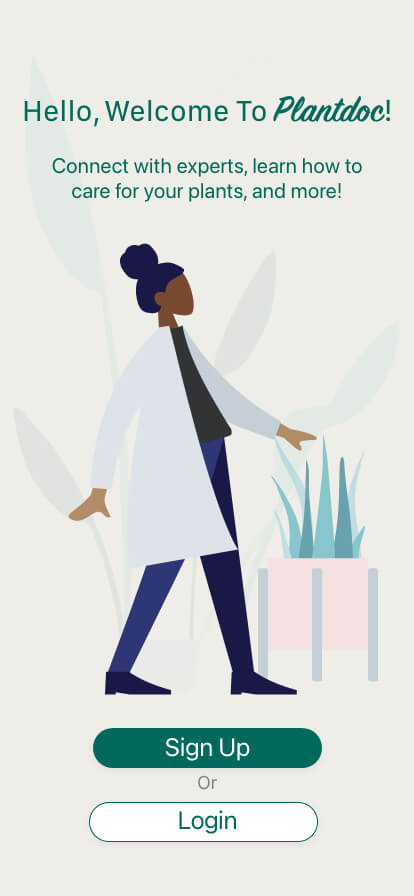
PlantDoc
A telehealth mobile application for houseplant care
ORIGIN STORY
It's 2020 there's a pandemic, and everyone is buying plants.
I noticed an overwhelming amount of friends and internet strangers filling their apartments (and hearts) with plants, and then needing help to care for them.
I saw a problem emerging which was people needed a way to get plant advice from afar when their plants became diseased and unhealthy. I noticed that Facebook groups had really taken off and nearly every post was a plea for help. It can be hard to diagnose what's wrong with plants if you're not super knowledgeable, so I decided to create a platform that would connect people with plant experts virtually.
ROLE
Lead designer
Solo project
DURATION
9 months
THE WHAT
Through an iterative design process, I created an end-to-end mobile first product.
THE HOW
pen and paper, Figma, Adobe XD
User testing, mobile application design, product strategy & roadmapping, digital branding
The why
Users need an easy way to get trustworthy plant advice from their home. We know this to be true due to how many online plant forums there are with people looking for help. My early research has also shown people give up with plant care, and throw away their plants instead of trying to help them.
So, I believe that by creating a platform for users to get expert advice about plant care, we can minimize how many plants end up in the garbage. By educating people, we can empower them to be better plant parents.
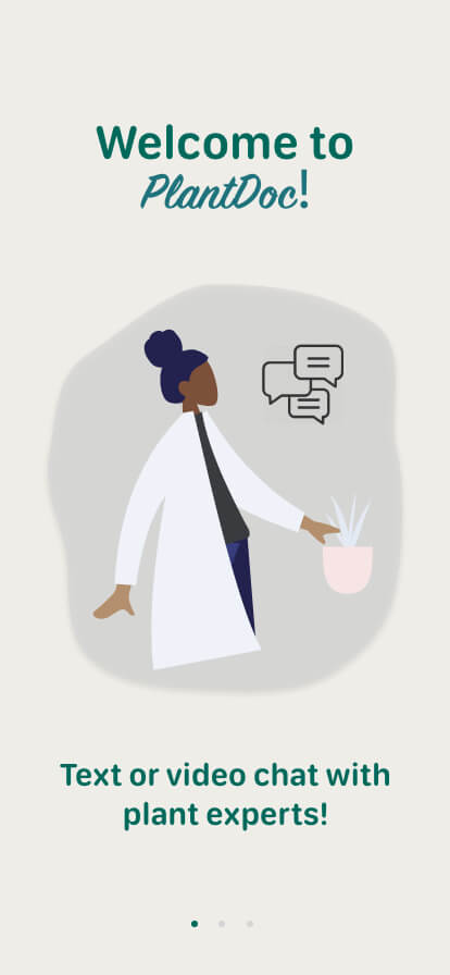
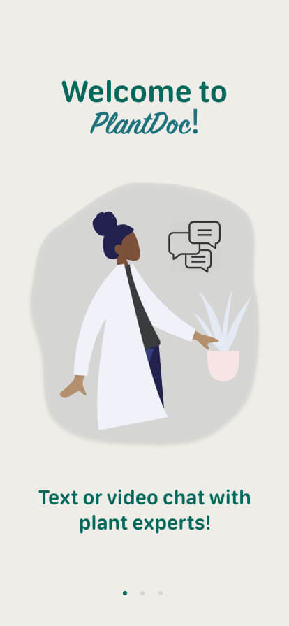
A few possible solutions I hypothosized
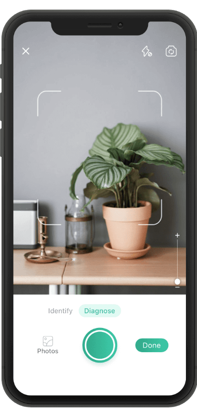
- An app that allows users to connect with a plant expert via video chat. The user can show the expert their plant and explain the problem that the plant is having. The expert can ask follow-up questions, then offer advice for how to better care for and or save their plant.
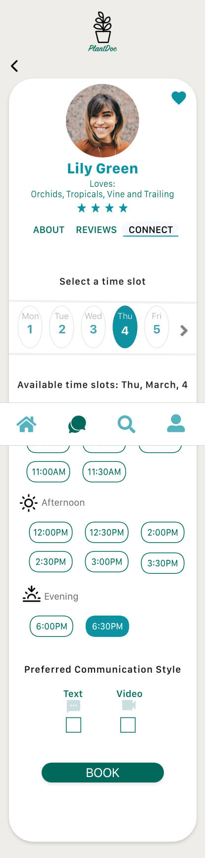
- Users would be able to book an appointment with the expert on the platform when it’s convenient for them. Appointment times could be almost 24/7 due to time zones and availability of experts all around the world.
- Experts would be vetted before getting onto the platform and then rated by users, so users would feel sure they are getting trustworthy advice.
RESEARCH
I started with a competitive analysis, which showed me that the market was pretty open for this product. Since I didn't find a direct competitor, I found three apps that were similar to research.
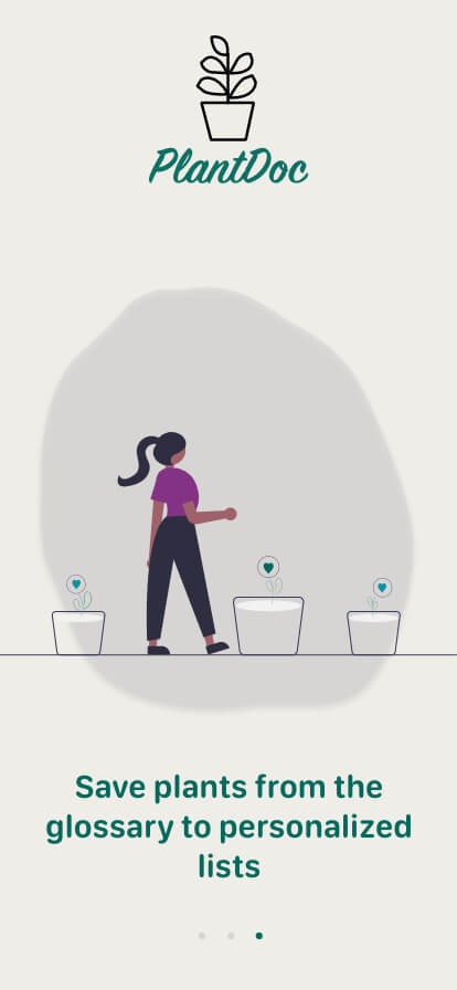
Through user interviews, I learned that people often feel overwhelmed and underwhelmed with information all at once. What this means is, there's a lot of information available about plant care online, but there doesn't seem to be just one place where it's all gathered. Several people told me that they have to jump from site to site in order to find information, and then they end up with all different schools of thought.
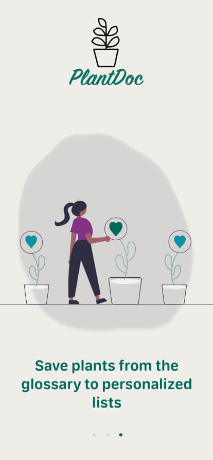
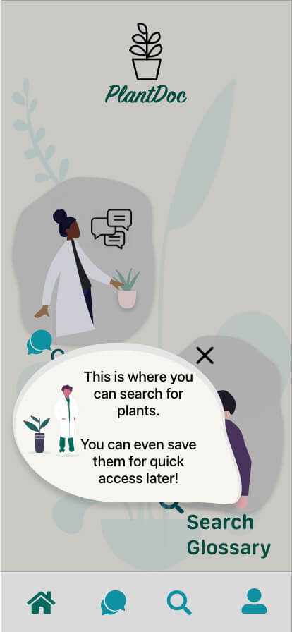
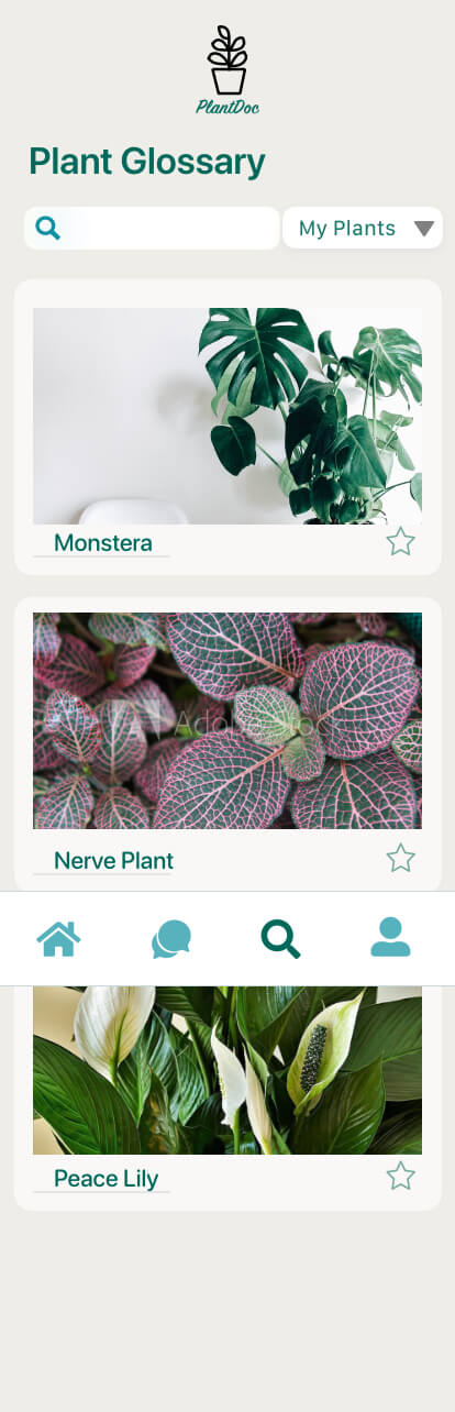
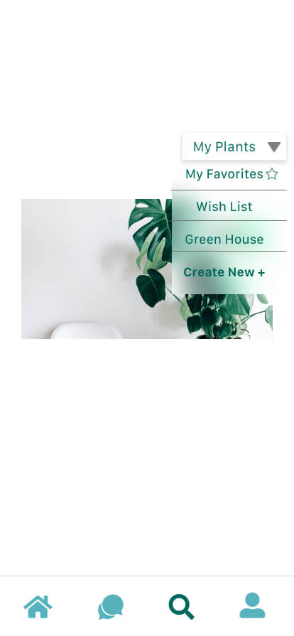
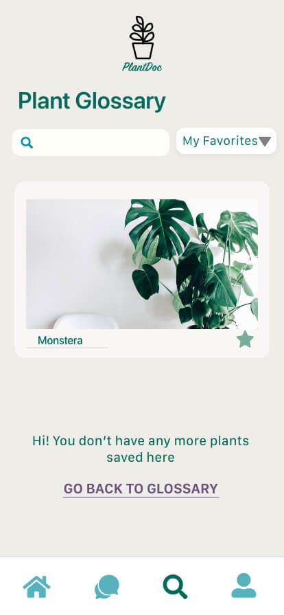
I decided to implement a feature that would allow users to search for plant information, and then save plants to lists for easy safekeeping.
COMPETITOR ANALYSIS
Picture This! - Plant Identifier (mobile app)
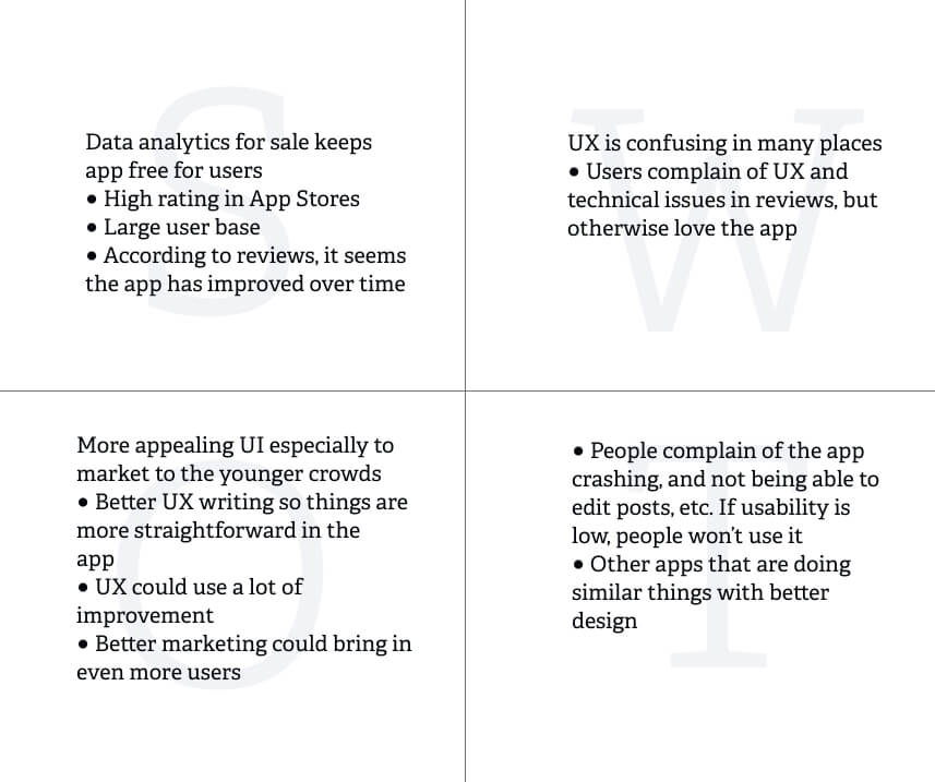
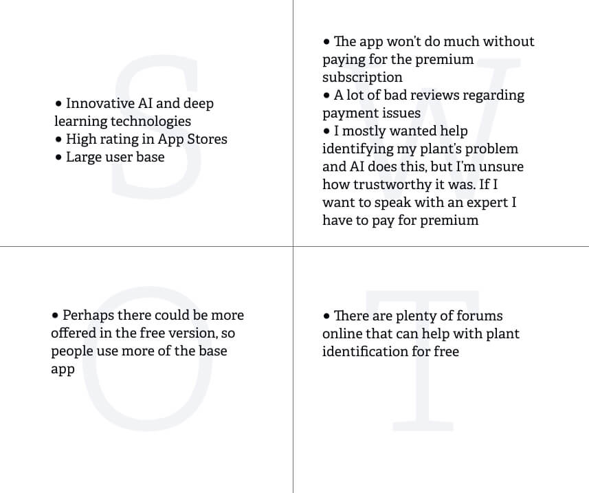
OVERVIEW The first app I looked at is called PictureThis -Plant Identifier. Their main objective is to help people identify plants by using deep learning and artificial intelligence technologies. Learn more here.
BOTTOM LINE ●They aim to stand out by having a lot of users. I think the strategy here is, “if everyone is using it, it must be good”. ●They seem to try to be pushing their good ratings, as I’ve seen mention of it several times on their website. ●Their large number of encyclopedia-esque entries on the app seems to be a large feature they are using to set themselves apart.
SWOT analysis
GrowIt! The Plant Community (mobile app)
OVERVIEW GrowIt! The Plant Community is an app that is focused on being a social community for plant growers since 2015. It’s location based and the community is meant to be a place where people can share their progress gardening, or ask the community questions. GrowIt! Collects and analyses data from the online conversations that people are having and creates reports for the horticultural industry. They offer free reports, or you can subscribe and receive more detailed reports as well. They help predict trends and offer insight for those who may own a plant shop or nursery. Learn more here.
BOTTOM LINE A few apps are trying to make an online social community for plant lovers, but they seem to have the largest user base. I think because their blog is very active, they get a lot of hits when you search for plant help. They also are popular since they offer the consumer reports for the horticulture community. ●Their ratings are high. ●They appear to have the most active social community.
SWOT Anaylsis
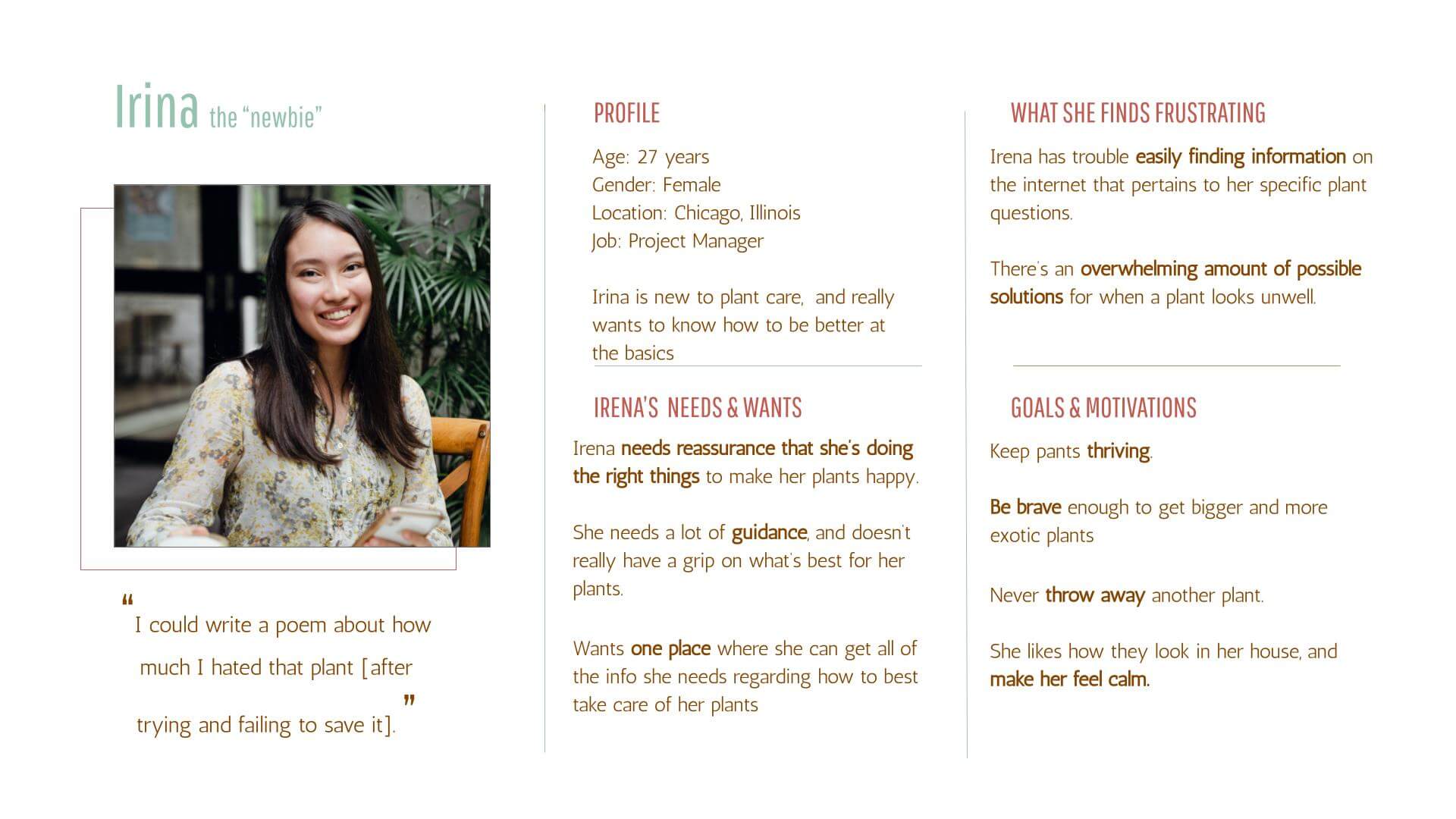
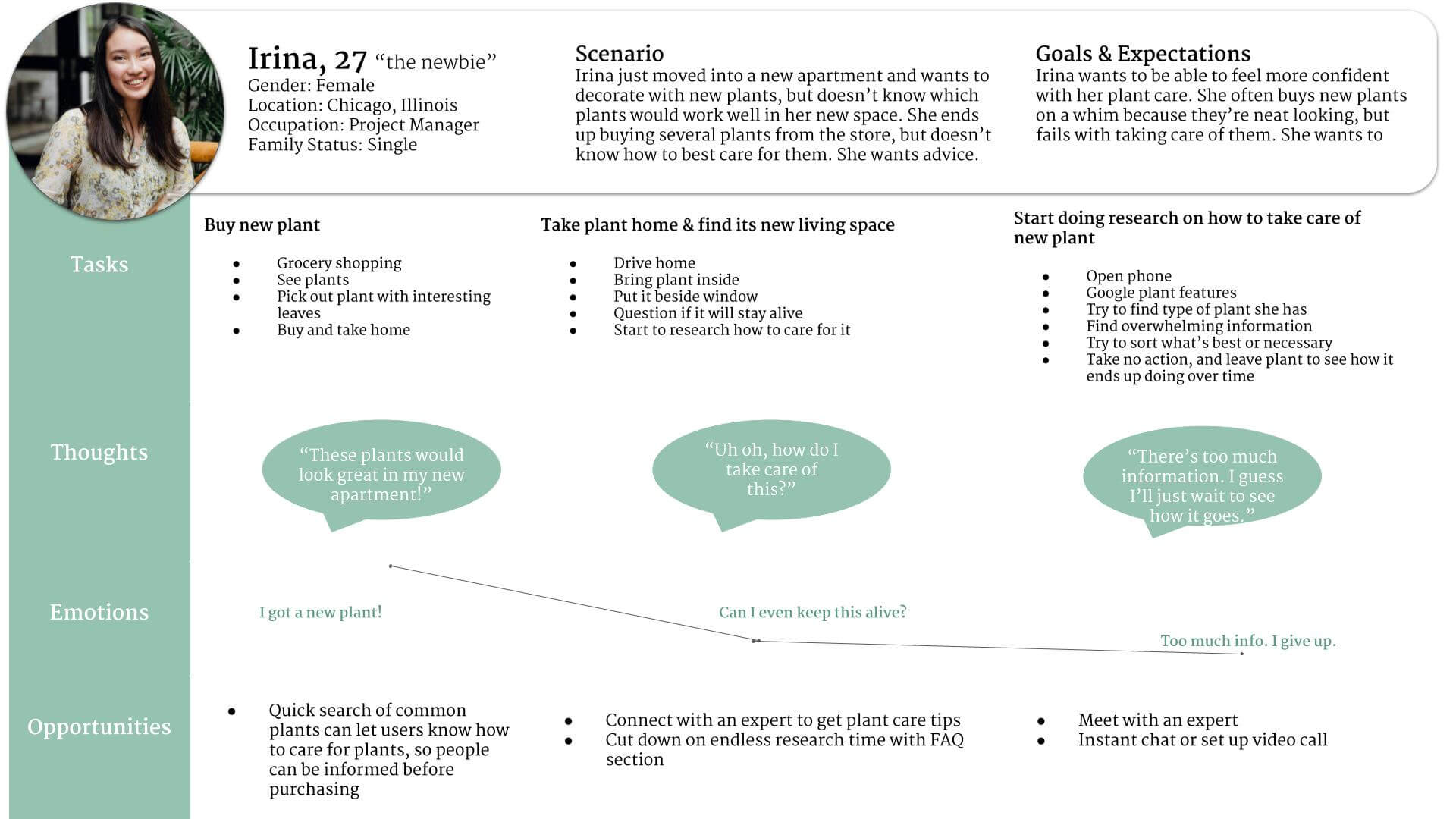
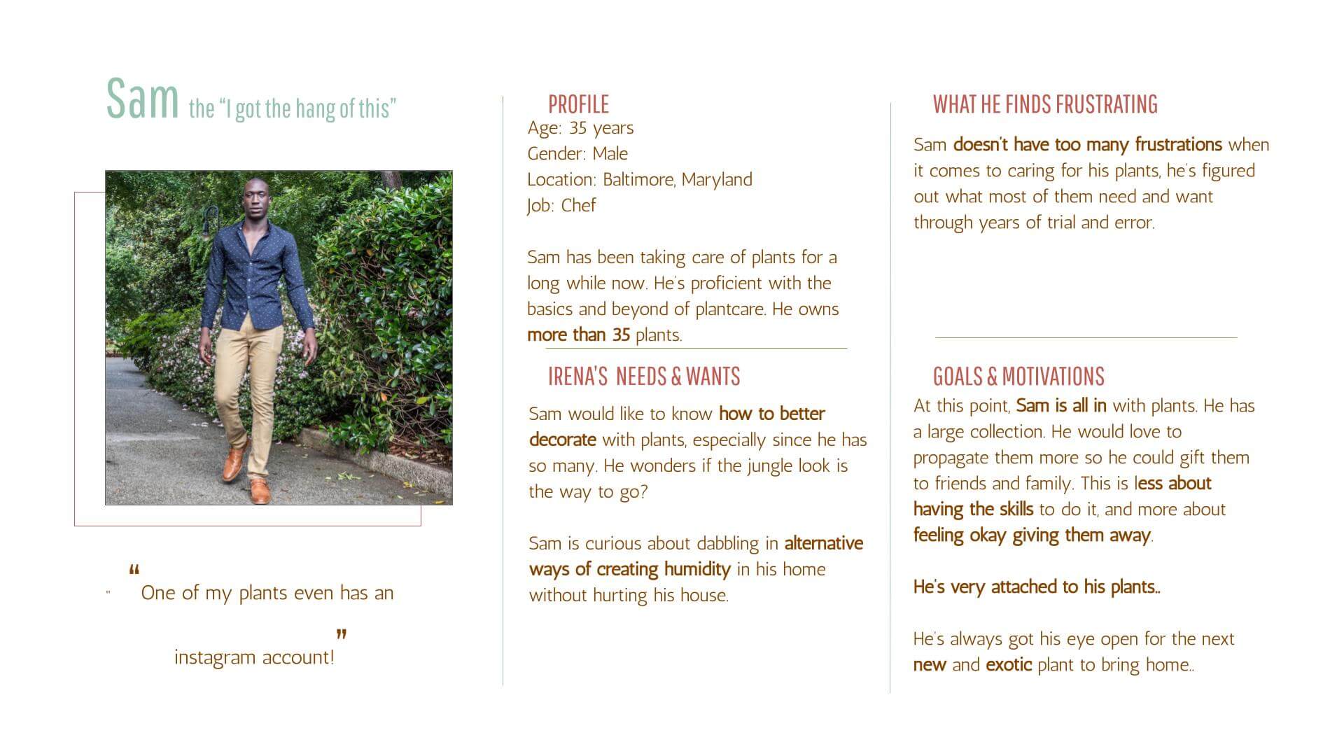
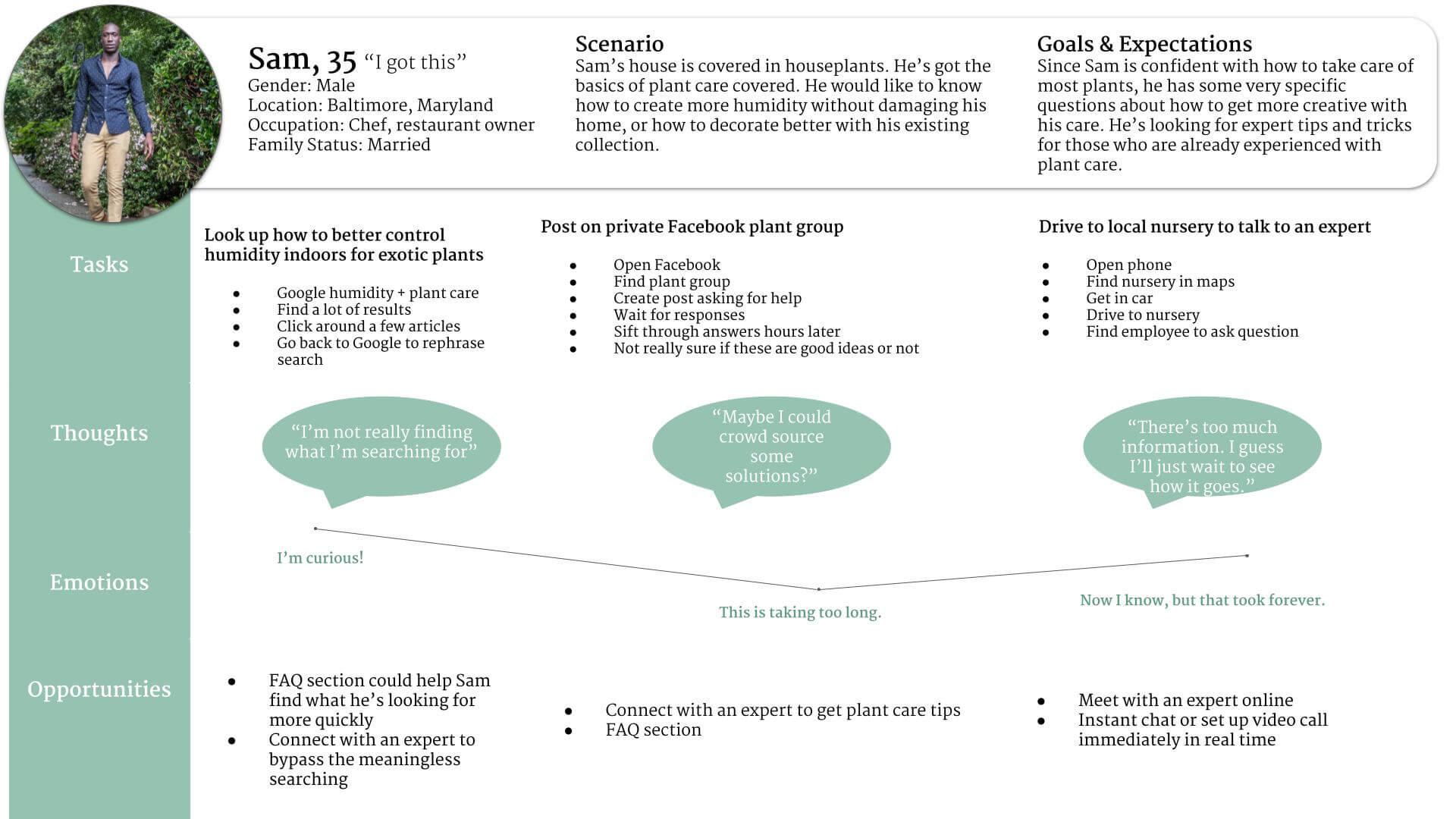
USER PERSONAS & USER JOURNEY MAPS
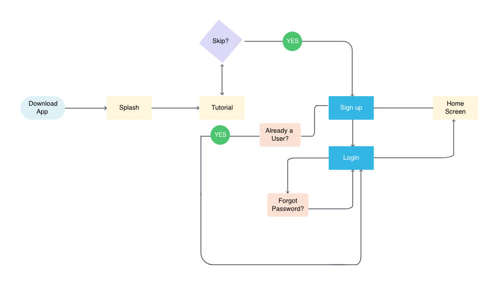
USER JOURNEY FLOWS
This user flows shows the initial onboarding process for what the app currently does.
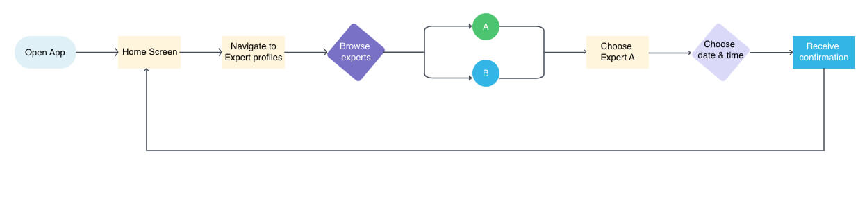
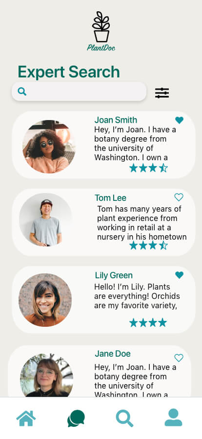
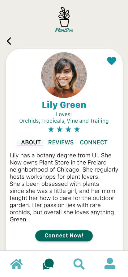
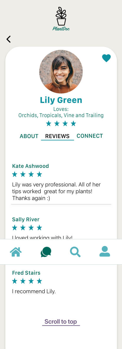
This flow shows how a user can browse expert profiles, then decide to book with a particular expert.
PROTOTYPING
Next, it was time to start sketching and creating wireframes. My initial research confirmed many of my thoughts and ideas about what users may need from an app, plus gave me some great insight into what else could be useful.
LOW-MID FIDELITY WIREFRAMES
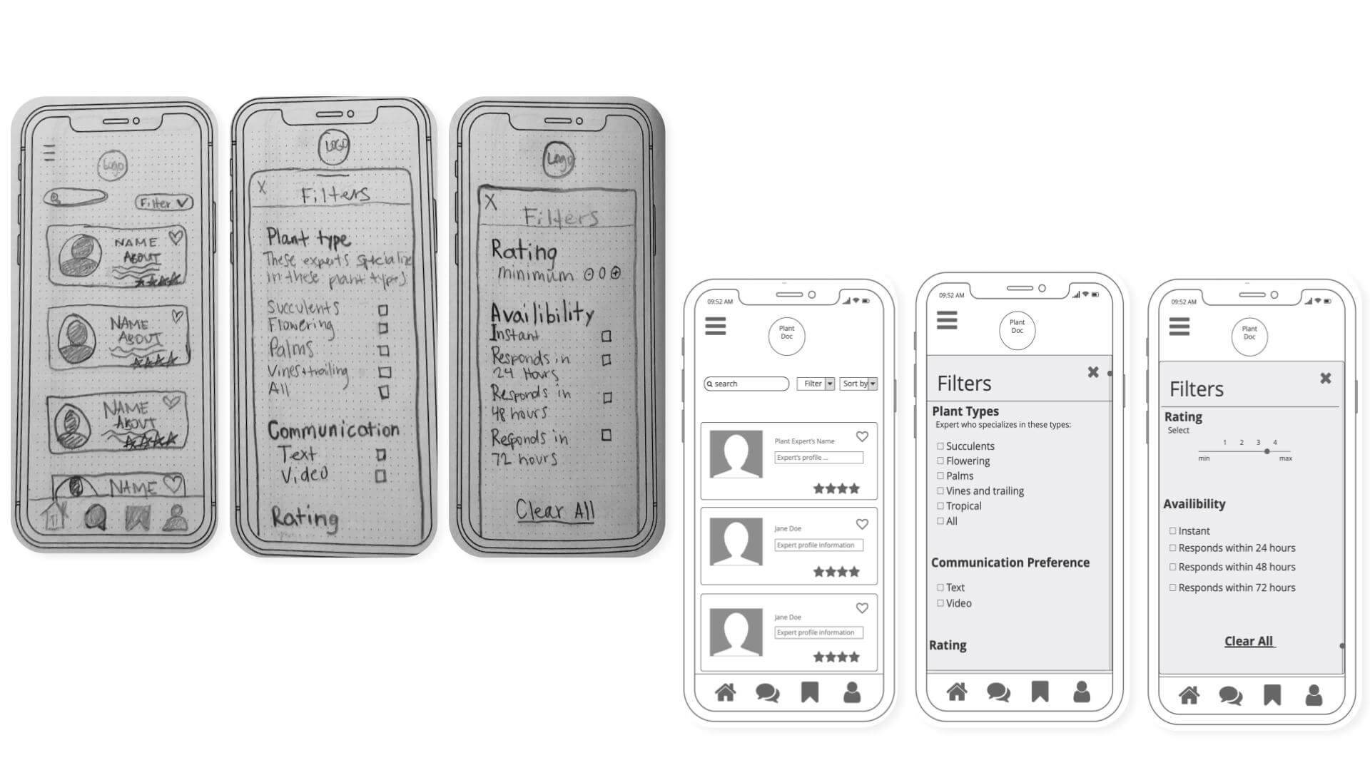
TESTING
Results from usability tests organized into four categories:
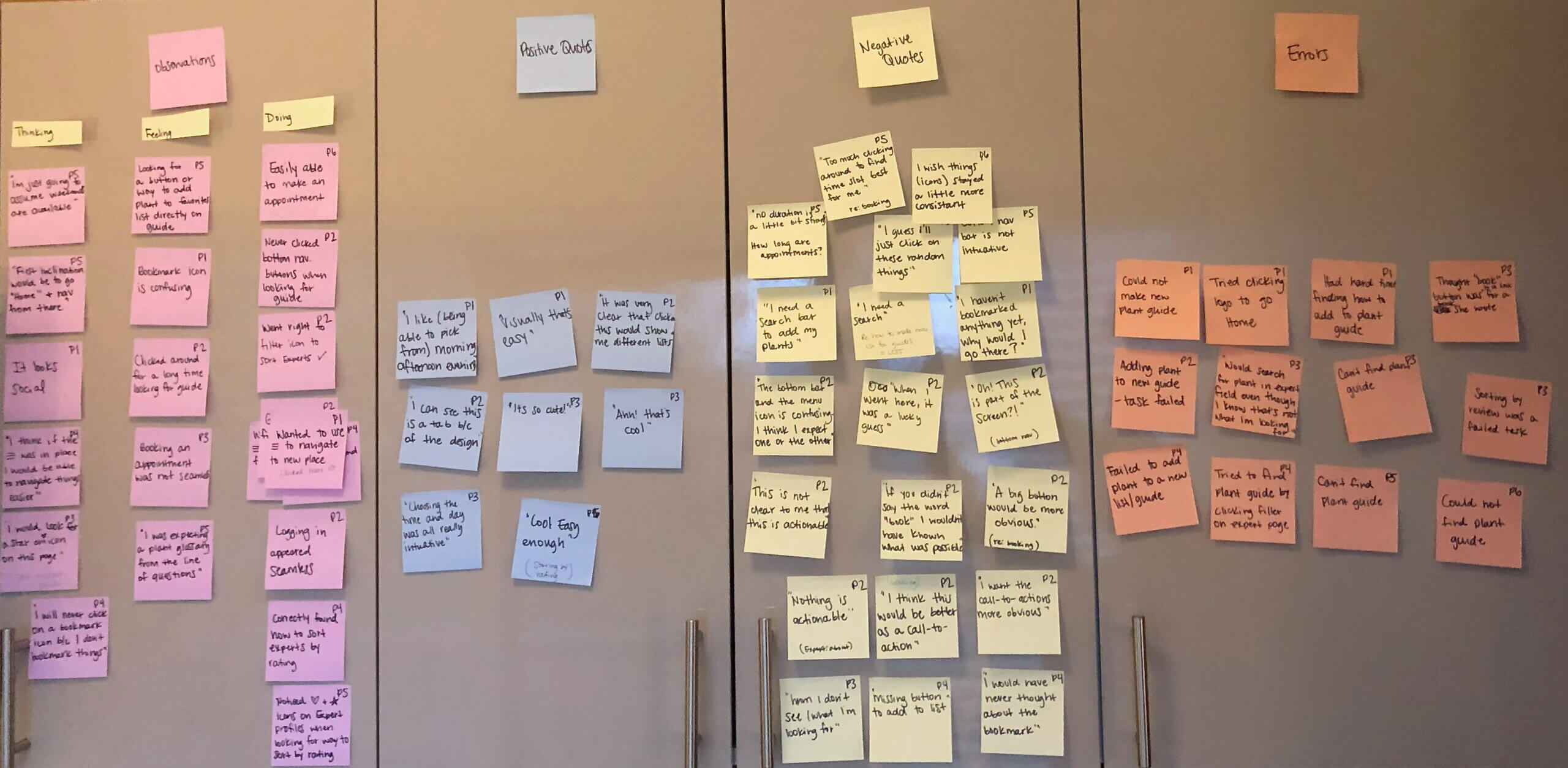
Obligatory post-its photo ;)
OBSERVATIONS
THINKING
- "I will never click on a bookmark icon because I don't bookmark things"
- "I would look for a star or heart icon on this page"
- "It looks social"
FEELING
- "I was expecting a plant glossary from the lines of questioning" (confused/lost)
DOING
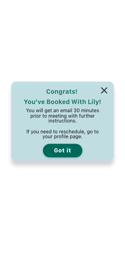
- Easily able to make an appointment
- Never clicked bottom navigation buttons when looking for guide.
- Correctly located how to sort experts by rating
- went to (hamburger menu) first x3
- Logging in appeared seamless
POSITIVE QUOTES
- "It was very clear that click this would show me different lists"
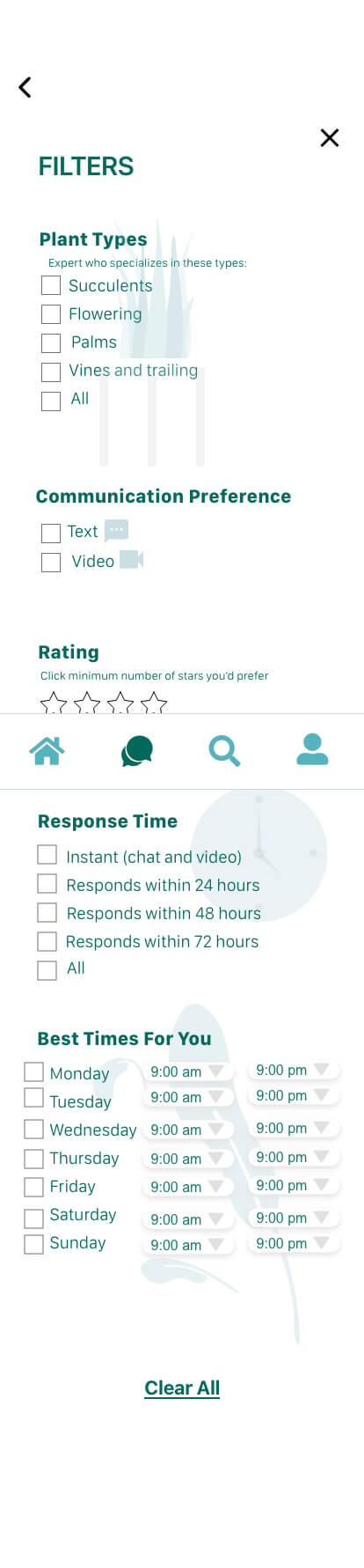
- "I like being able to pick from morning, afternoon and evening"
- "Ahh, that's cool!" (glossary)
- "I can see this is a tab because of the design"
- "Choosing the time and day was all really intuitive."
- "Super cute!!"
ERRORS
- "I guess I'll just click on these random things."
- "I wish the icons stayed a little more consistent."
- "Getting here was a lucky guess."
- "I don't see what I'm looking for."
- "Too much clicking around to find the best time slot."
- "I need a search bar to add my plants." x3
- "I would have never thought about the bookmark."
- "I haven't bookmarked anything, why would I go there?"
- "Missing button to add to list."
- "This is not clear to me that this is actionable."
- "I think this would be better as a CTA button."
NEGATIVE QUOTES
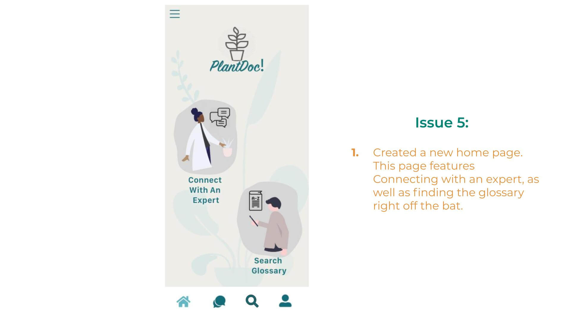
- Could not find Plant Guide (x6)
- Thought book button was a link for a book that the expert wrote vs scheduling (x2)
- Searched for specific plant in expert search field, though stated that this isn't where they feel like they should be looking
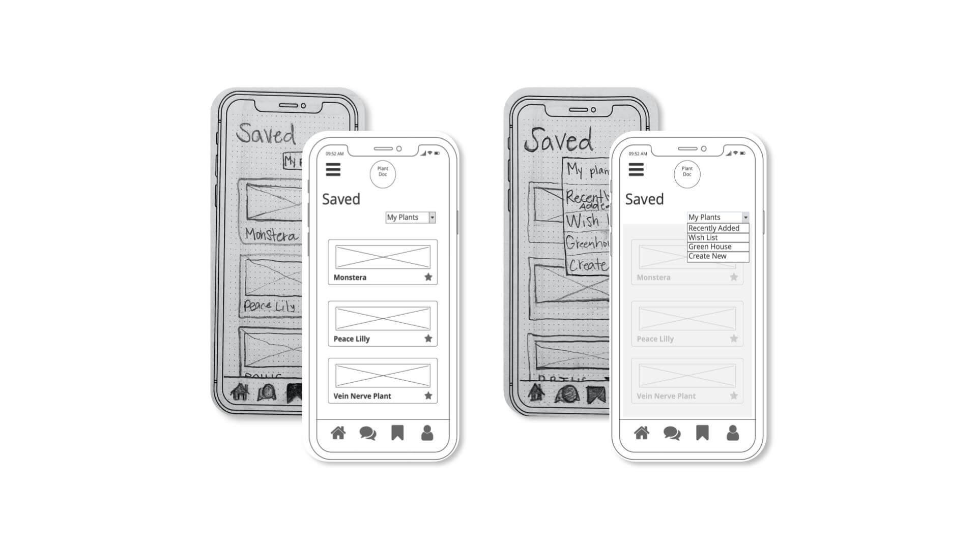
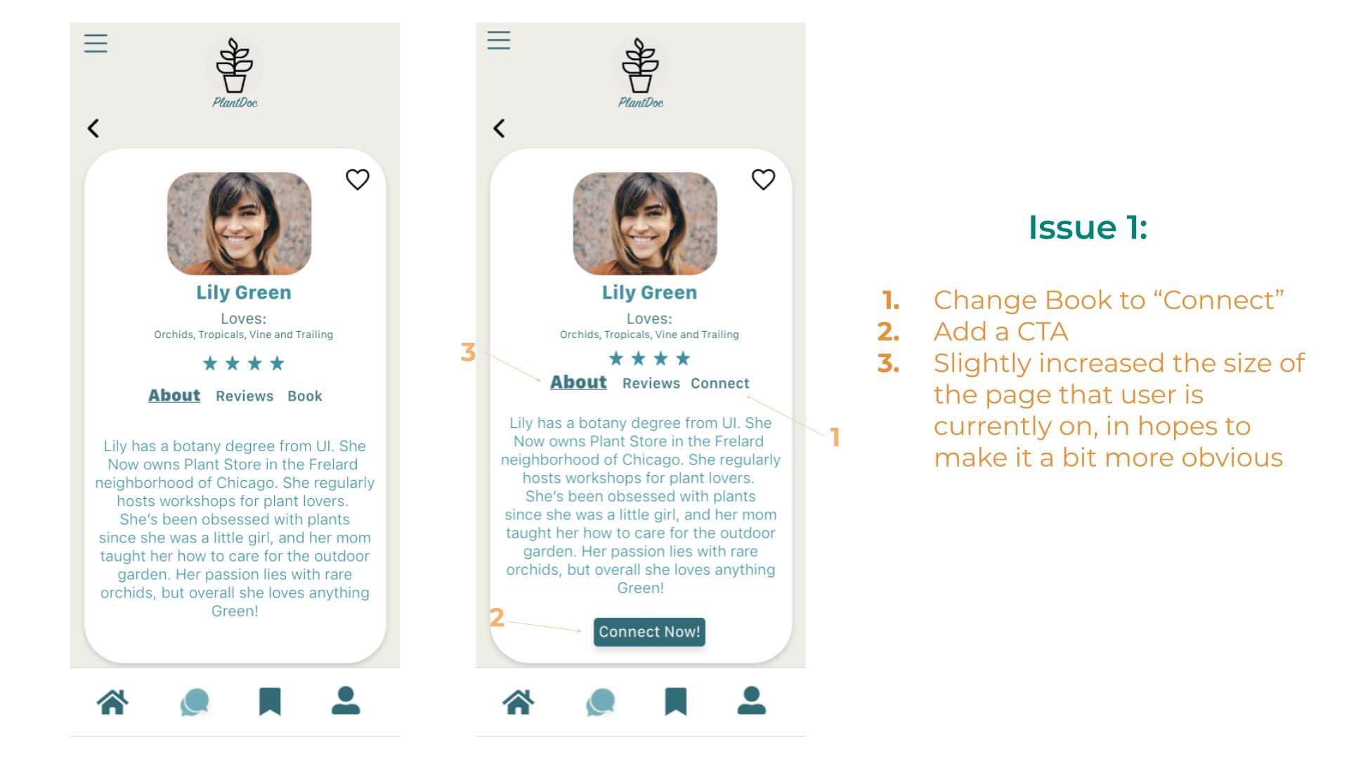
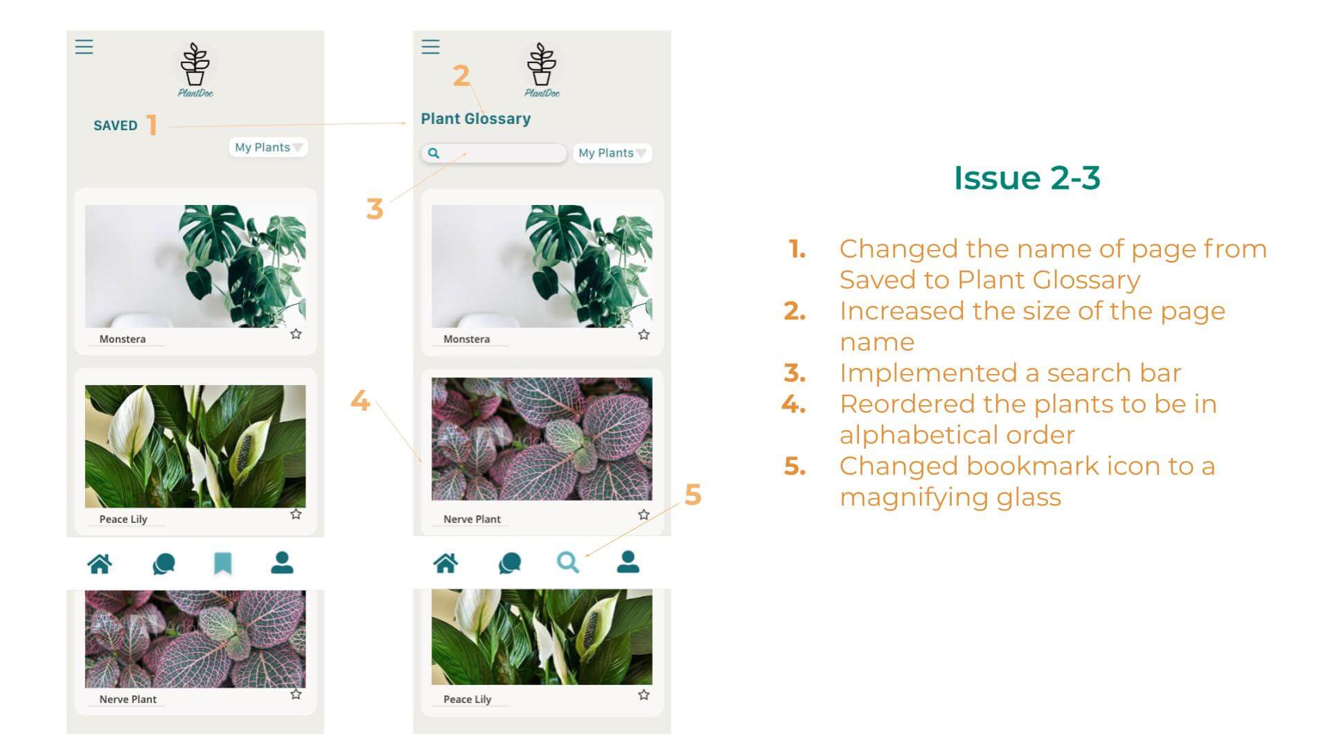
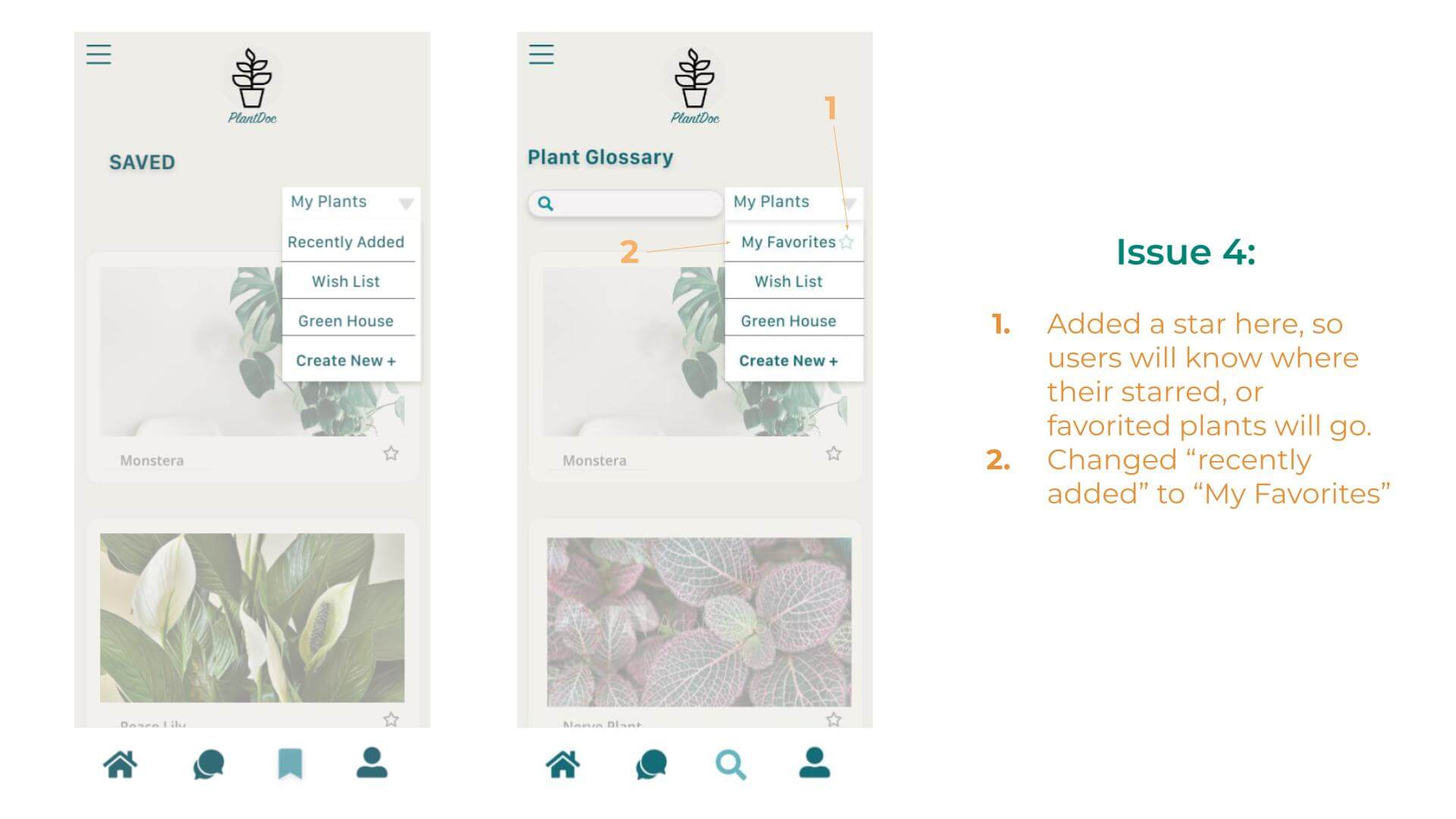
The biggest takeaway from this first round of user tests was that a whole section of the app was failing, and needed to be reworked, namely the section called Saved. After gaining such useful insights with the initial user testing interviews, I compiled all the results, and used them as a starting point for the reworking of the designs.
During the next phase of the design, I really honed in on the feedback I received from the prior usability tests. Many users were not able to navigate through each section of the app with confidence, so I reworked the main navigational themes, as well as changed some copy within the app. My hopes were to give better visibility at first glance, rather than the user feeling like they needed to click around to find what they needed. Shown here, are some reworks.
REFINING THE DESIGN VIA USABILITY TESTING
Once I moved the designs from low-fi to hi-fi, and changed some designs, it was back to testing. Shown below are some of the changes that were made based on test findings.
Feedback:
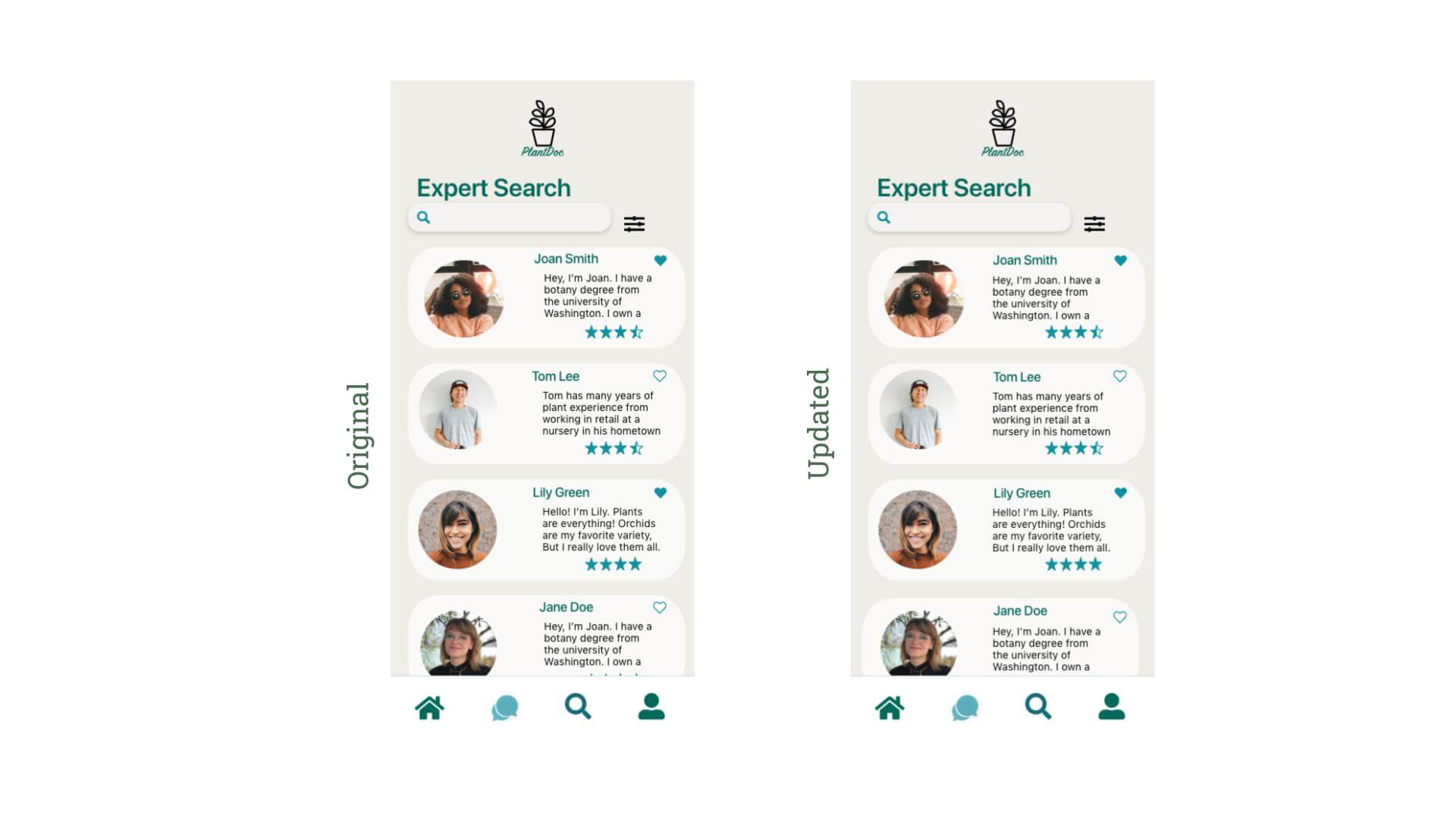
“I think it would look good if the name and the about me text would align.”
I decided this was valuable feedback, so I changed the cards so that the names and text align vertically with themselves. I think this helps to clean up the look and feel of the cards.
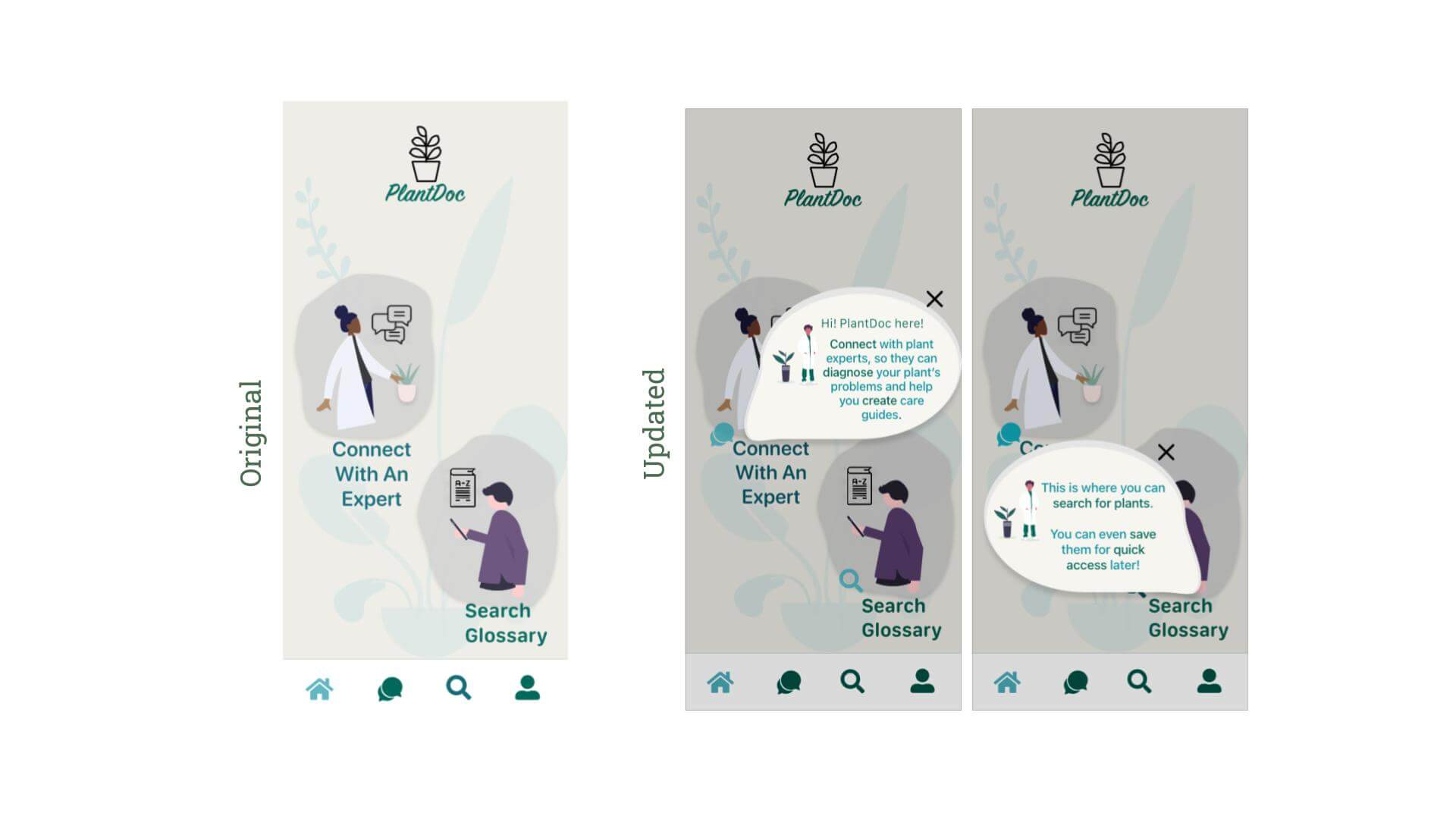
Feedback:
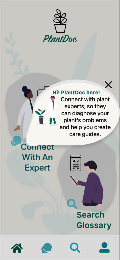
“I’m not sure why I’d want to connect with an expert at this stage“
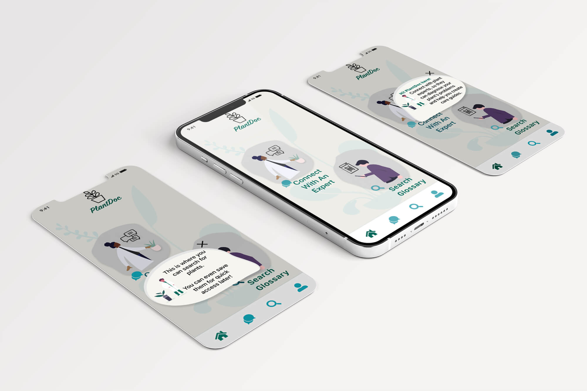
I made a pop-up tutorial that will be viewed, only when new users are signing in
Feedback:
“Love the illustrations - would like to see more of that and less of the pop-up.”
“I would minimize the pop-up window, there is a lot of empty space above "sign up"”
Edits made:
-smaller/tighter fitting
-have no exit
-made the background illustration teal to match the rest of the app
-Turned button green to match rest of app, and rounded corners
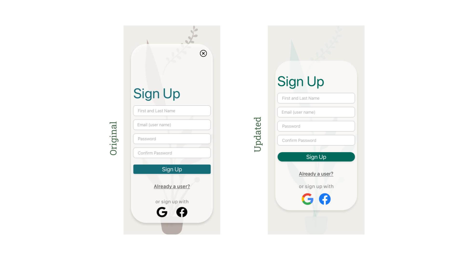
-Updated the social/alternative sign up icons to be their true colors to make them more recognizable
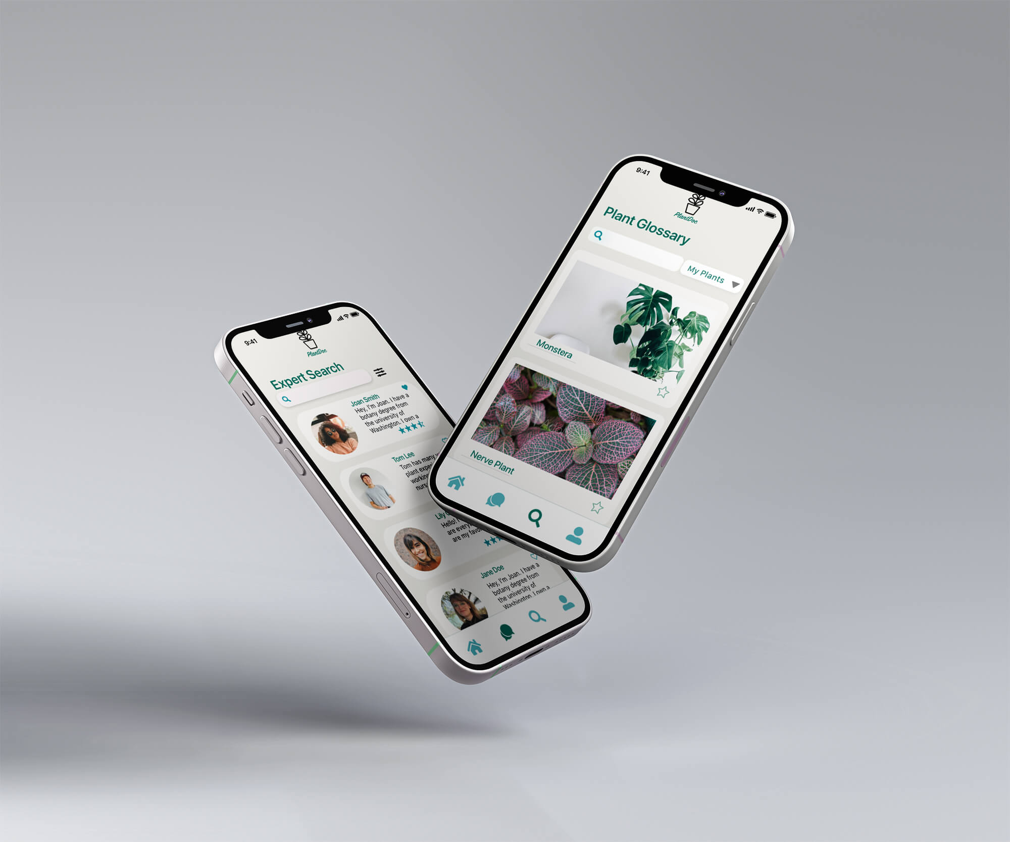
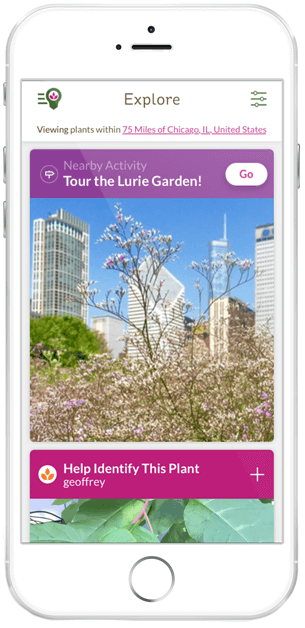
MOCKUPS
But first, let's set the mood.
FINAL WIREFRAMES
The final wireframes were a blast to design. I had so much fun with the animations featured on the onboarding pages, as well as using and modifying the characters shown throughout the app. The biggest lessons learned in the process of designing this app were: patience, the importance of usability testing and user feedback, if you're not sure, test it out, and finally, use those accessibility tools!
Let's take a look.
...and finally, you can check it out for yourself!
That concludes the case study. If you've made it this far, thank you so much! If you have any questions, or would like to work with me, please head over to the contact page, and drop me a message.