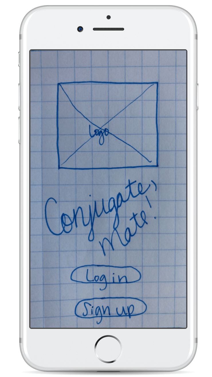
Conjugate, mate!
Project overview
I really enjoy learning new languages, and I'm fairly good at getting vocabulary to stick in my brain. However, after I learn the basic vocab for a new language, it's time to start with grammar. This is the tricky part. I wanted to create a simple flash card app that focuses on learning the verb conjugations for languages that use this type of grammar rule. But first, I needed to test my hypothesis.
*note, this project is showcasing my design methodologies.

The challenge
To create a simple and elegant flashcard mobile app that can assist in the learning of languages. I interviewed avid language learners to see if my hypothesis was correct --hint-- it was! Nearly all the participants confirmed that the apps they use skip over grammar rules, and they needed a better way to memorize the rules.
The process
My process was to do some initial research to see what type of flashcard app was most needed in the market by looking into the competition, and finding the most significant pain points with their customers. Once that was determined, I started the iterative design process.
The goal
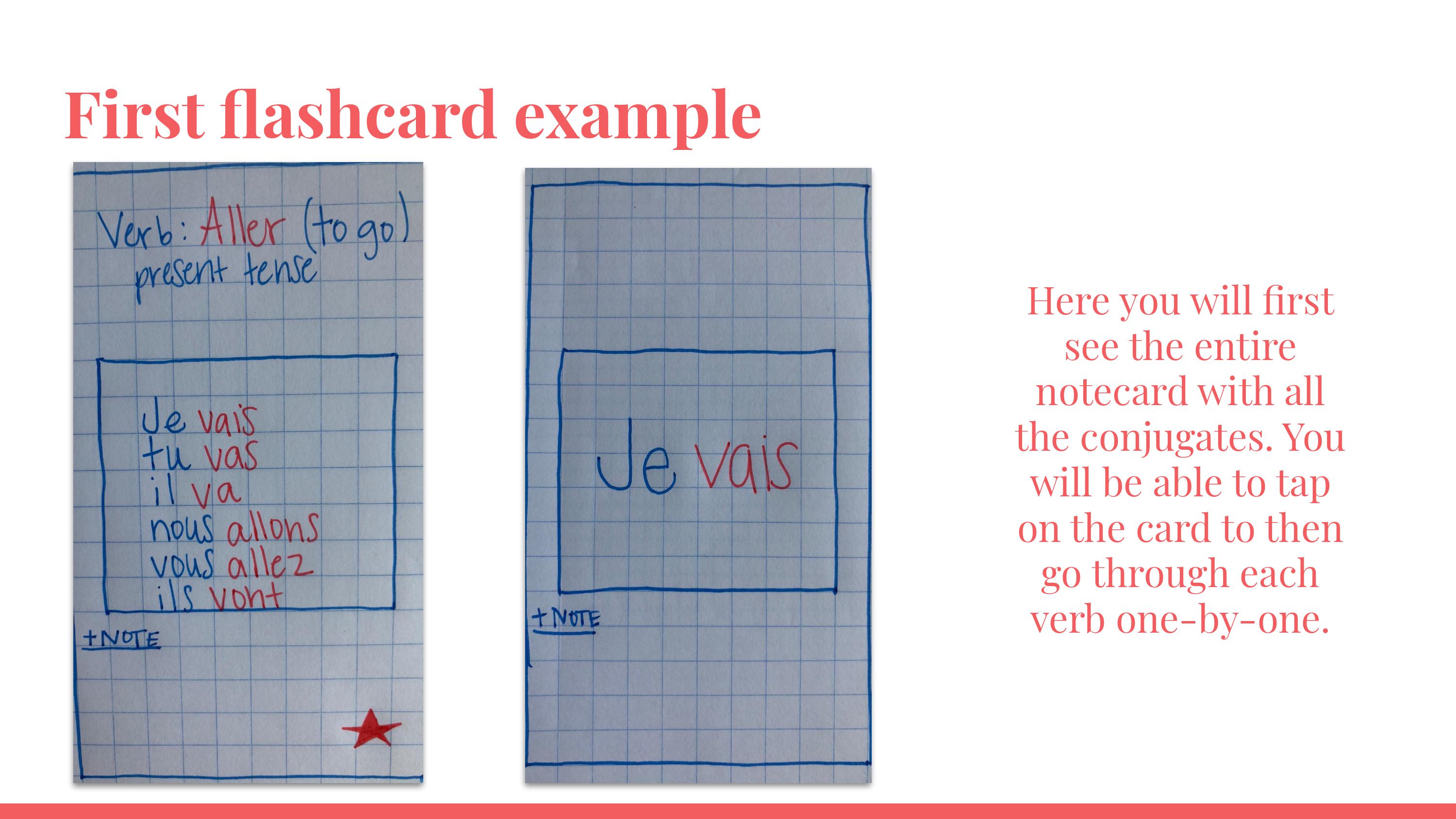
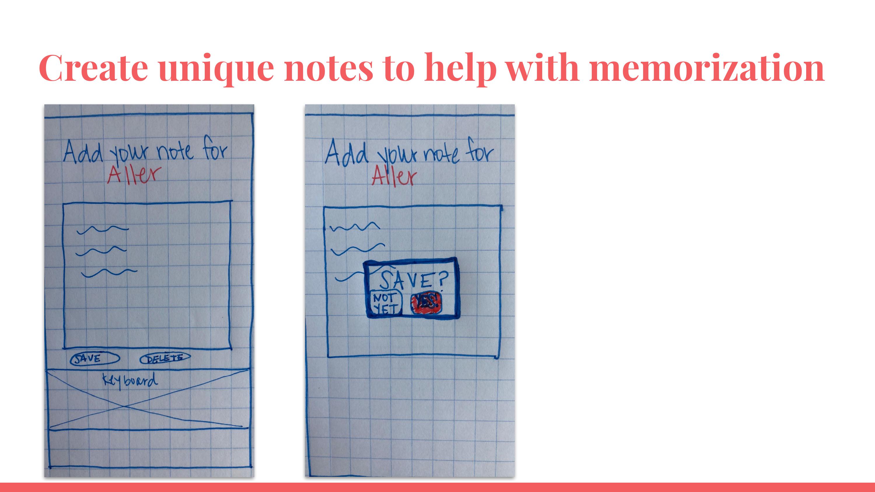
An easy-to-use flashcard app which aids intermediate language learners in the memorization of verb conjugations.
My role
UX Designer
UX Researcher
Solo project
Duration
30 days
Tools
Figma, Google Docs + Sheets, Zoom, pencil & paper
Competitive analysis
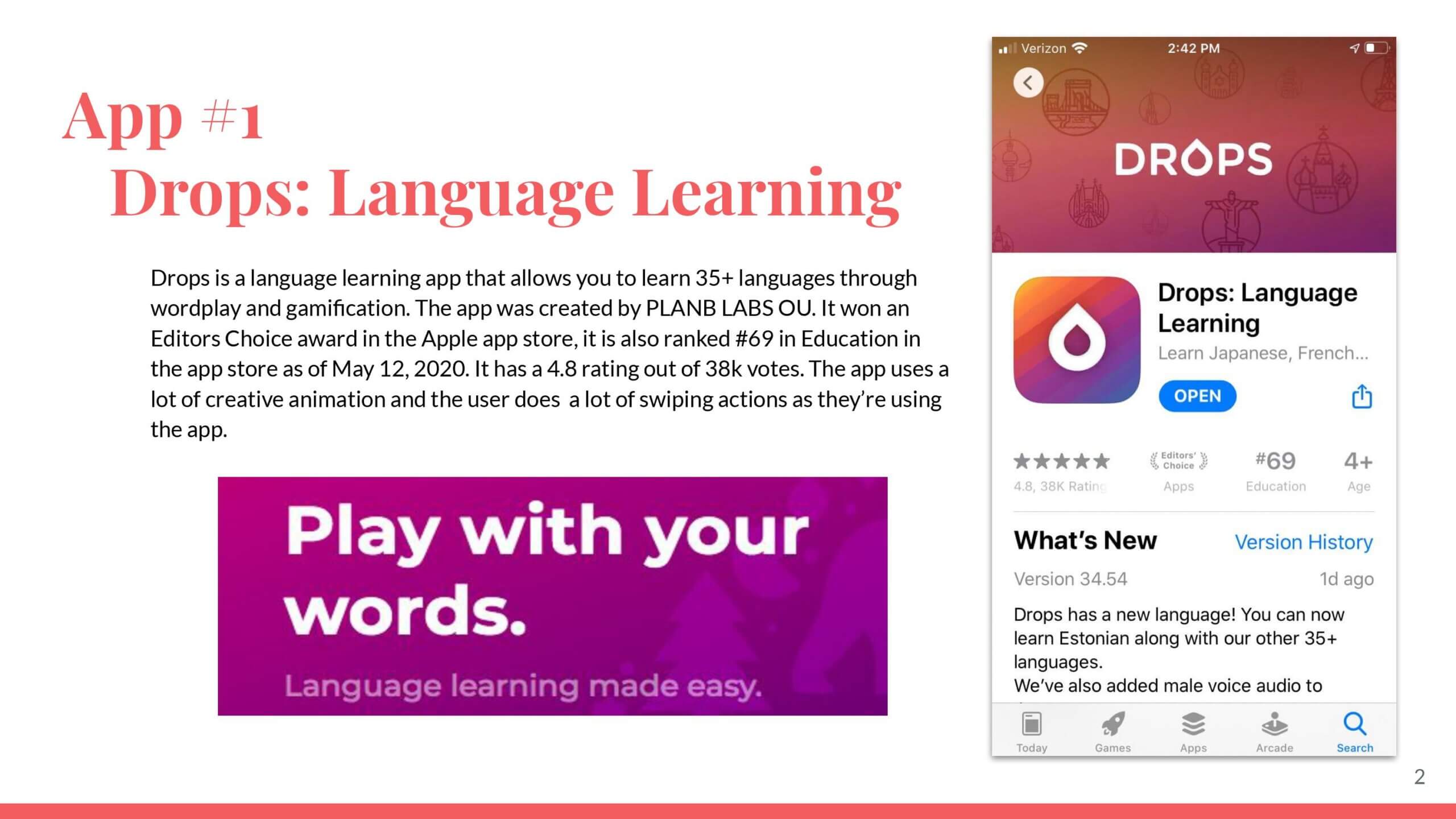
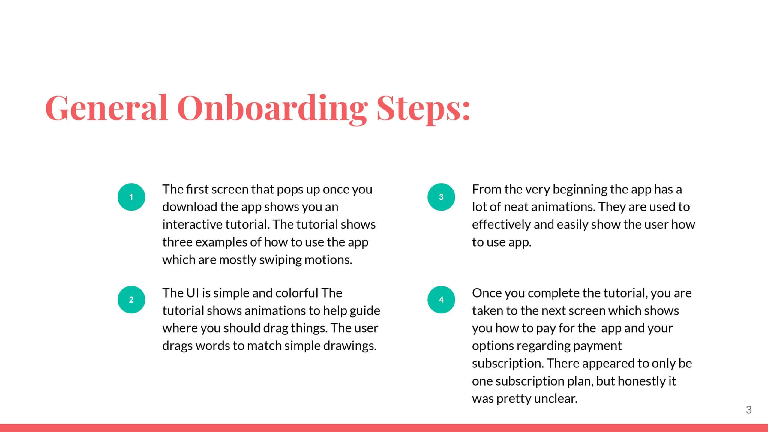
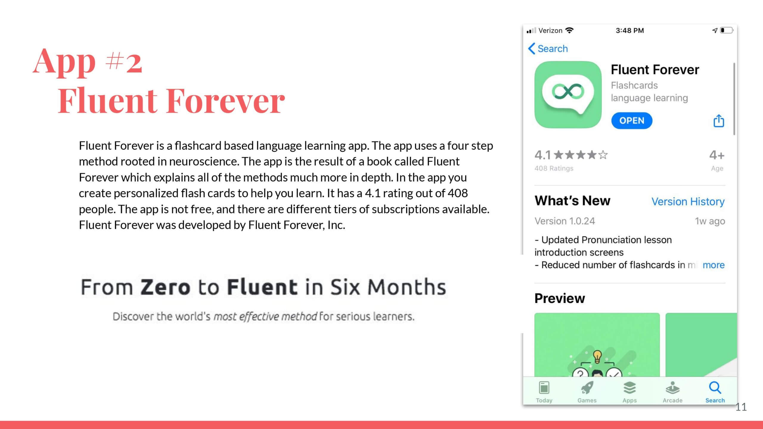
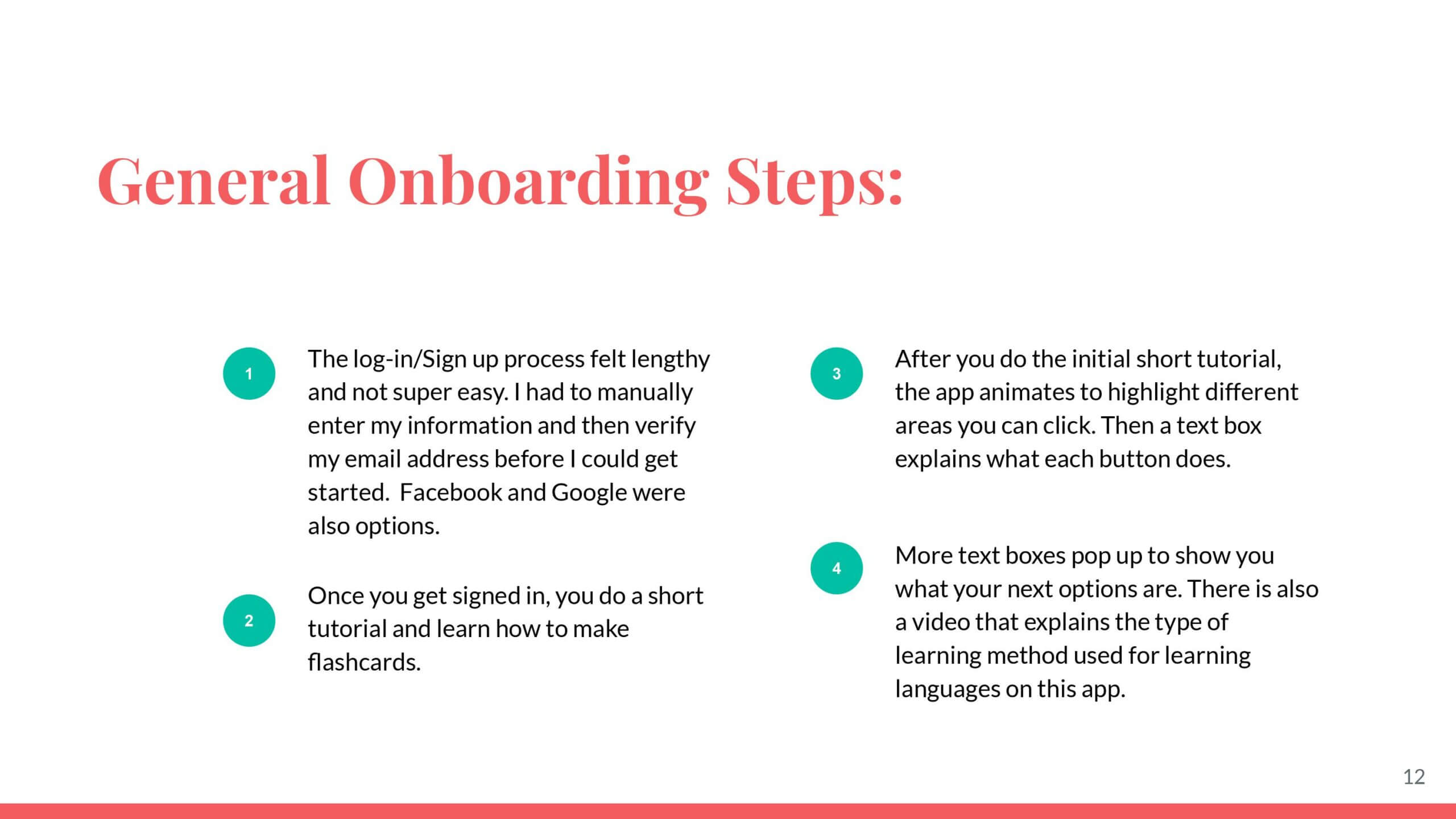
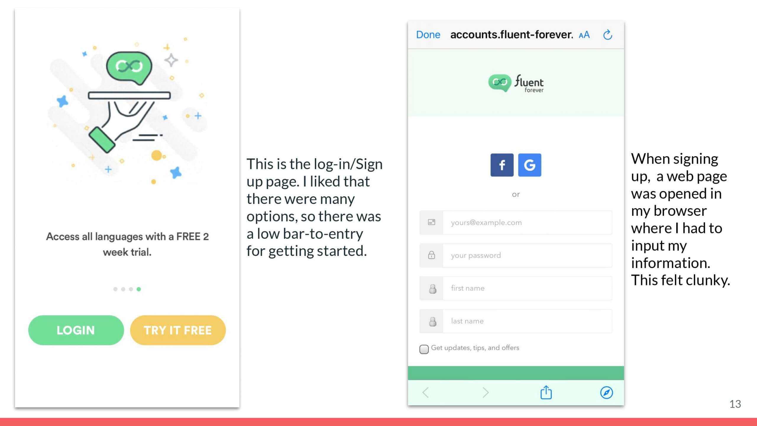
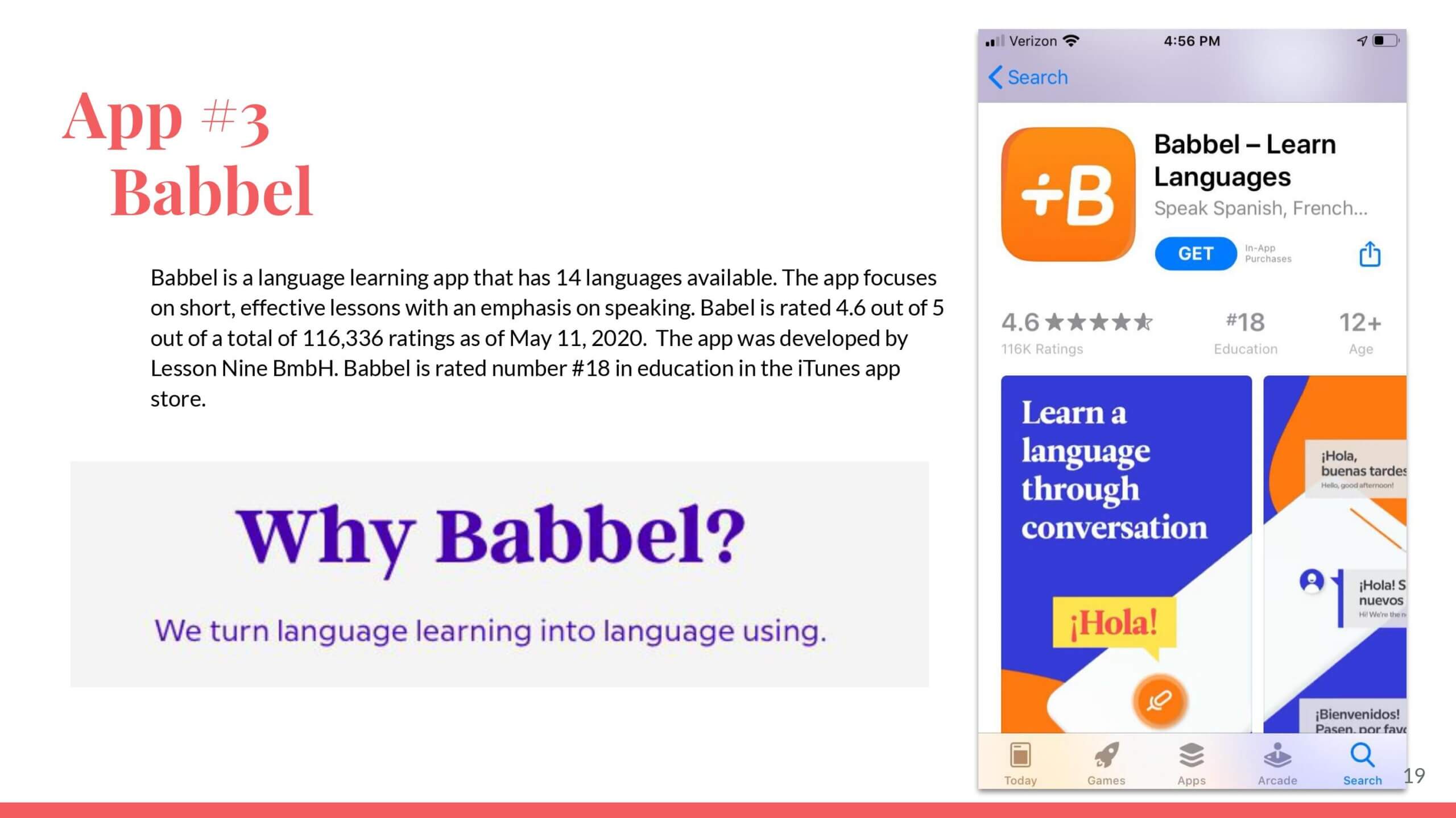
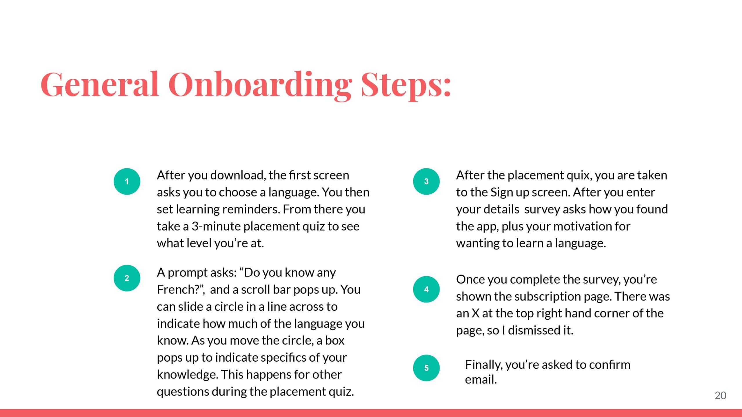
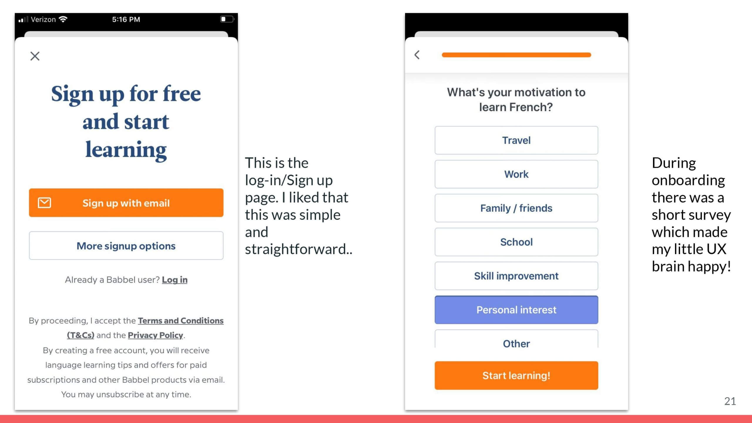
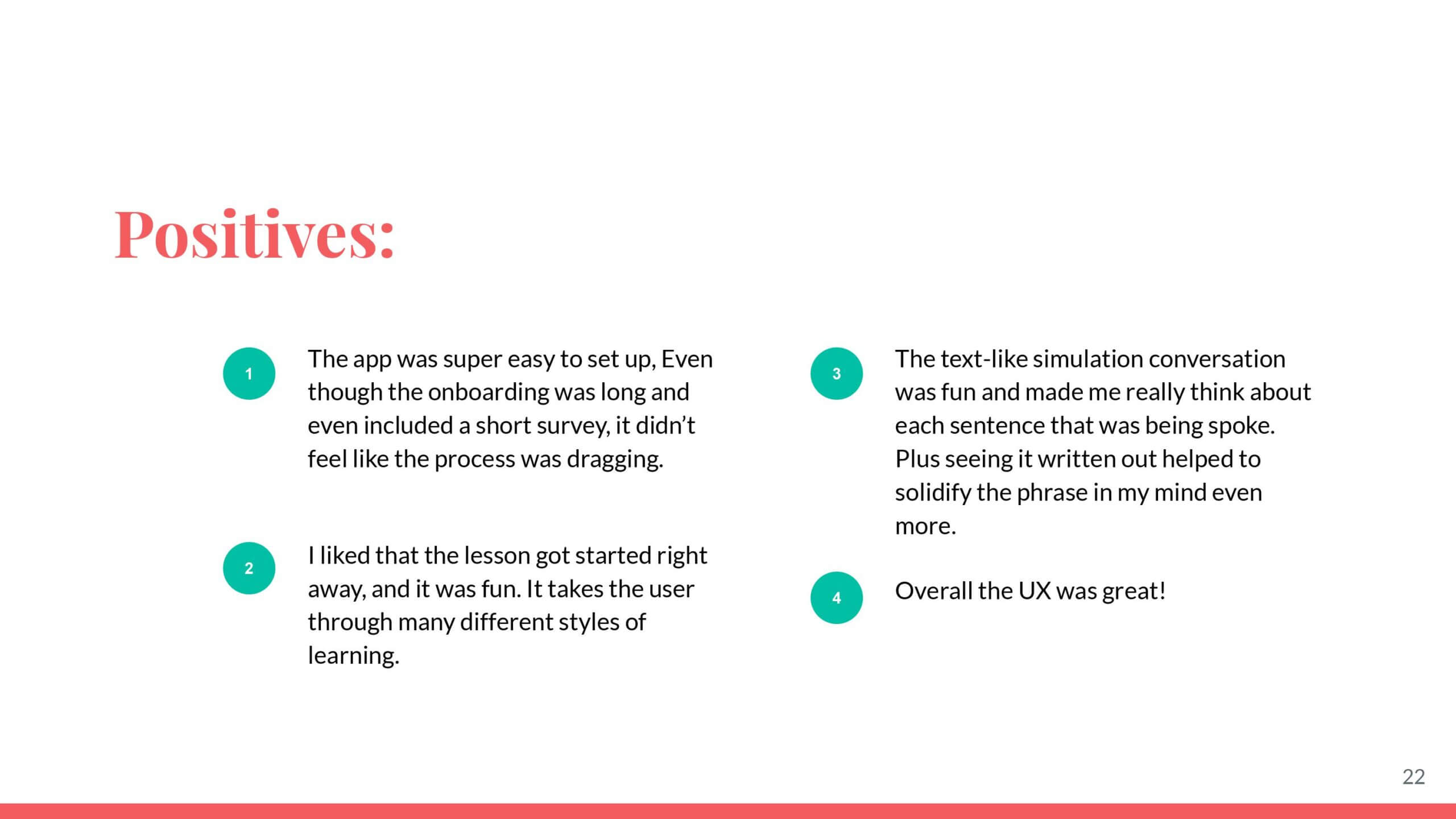
Okay but first, I had to put on my detective hat, and dive into other apps to see if maybe I've just been using the wrong ones this whole time. For the competitive analysis, I looked at three different language learning apps: Drops, Fluent Forever, and Babbel. Look into the artifact, for a detailed analysis of each.
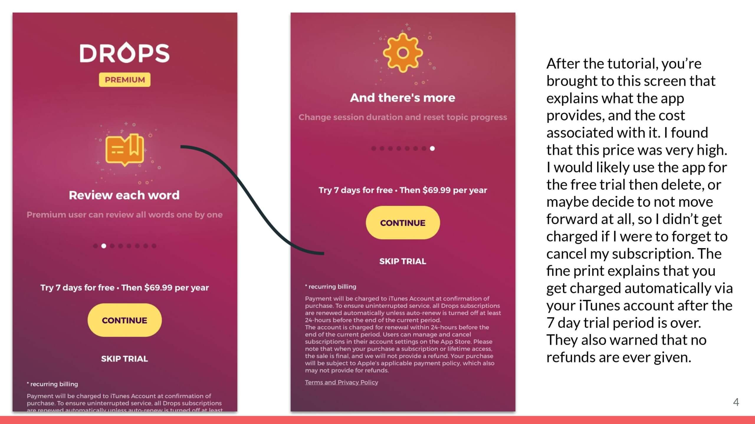
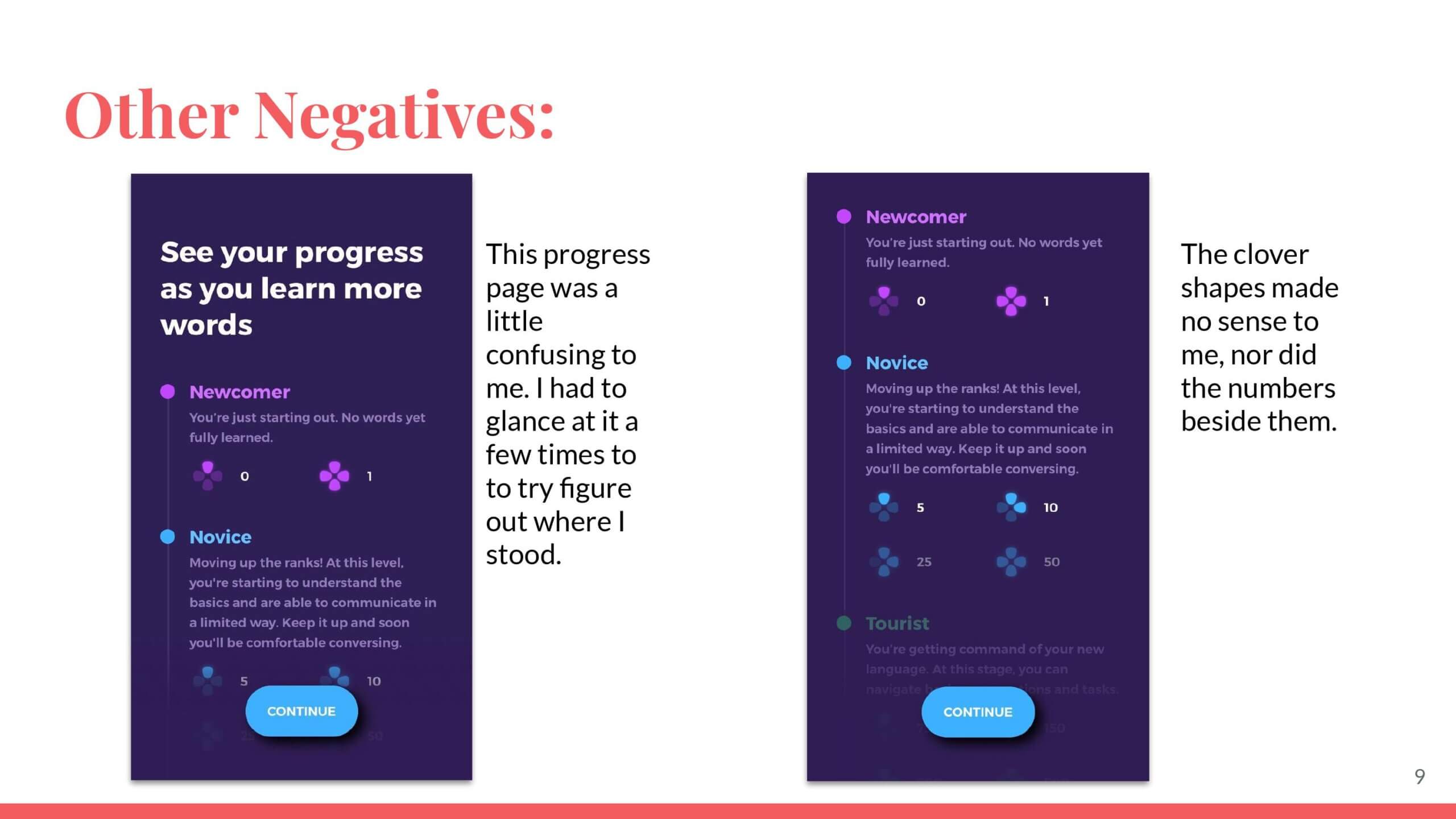
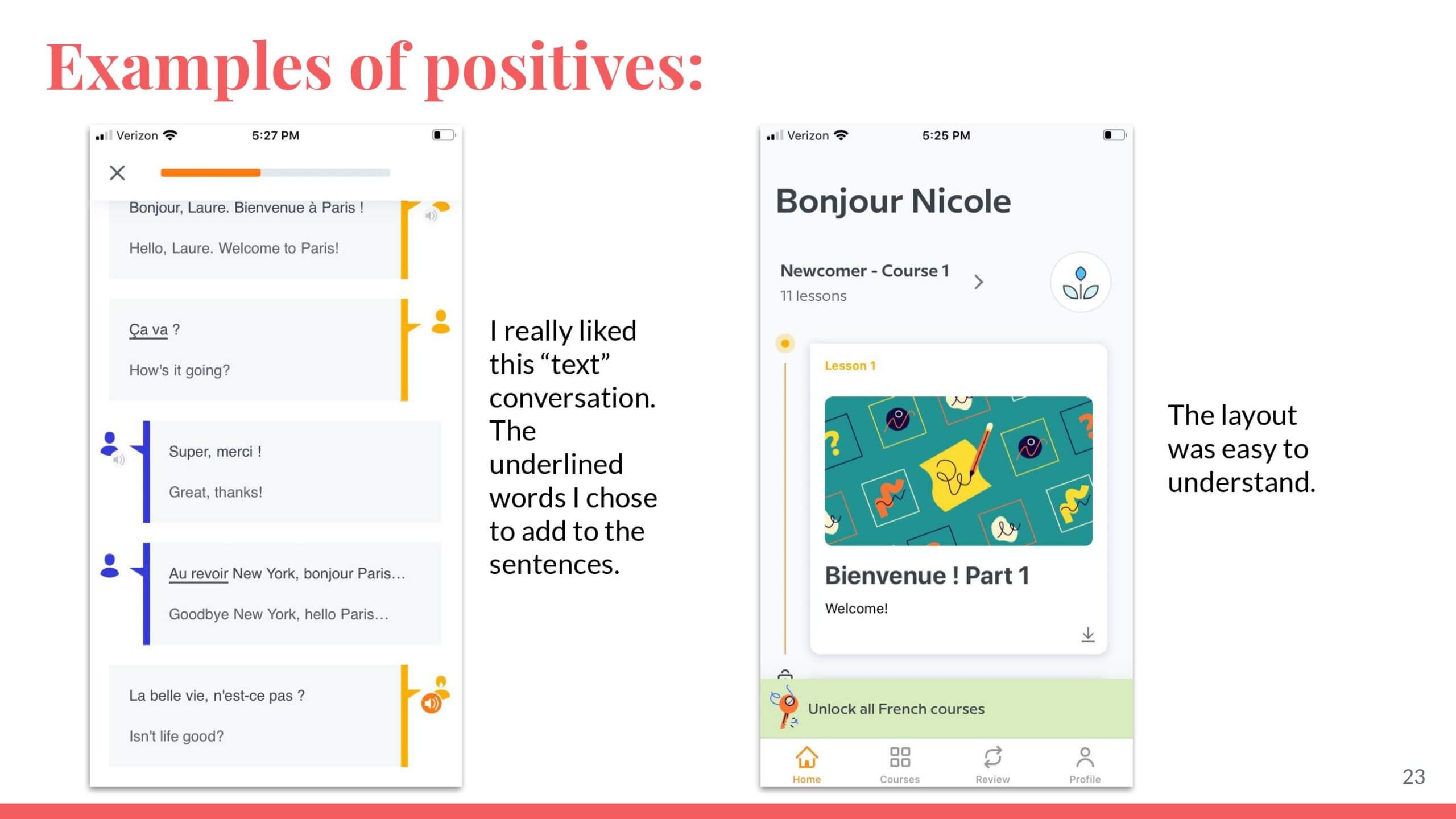
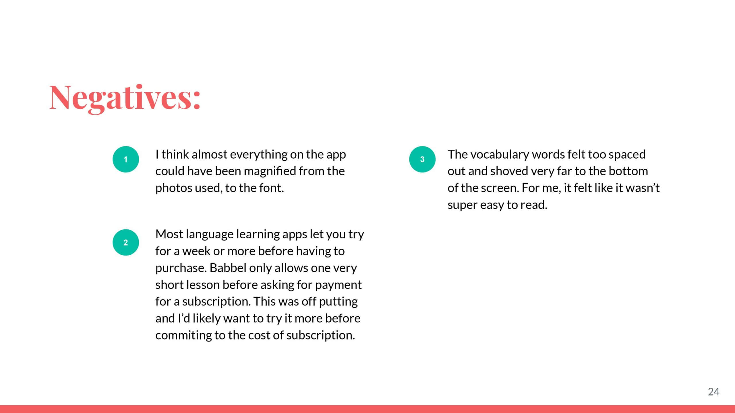
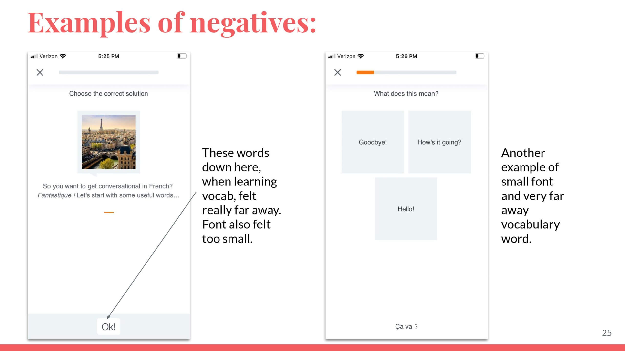
TLDR: None of the apps really had what I was looking for, so then I needed to, reach out to others people to test out my hypothesis. I wanted to know if I was the only one thinking and feeling this way about the apps lacking in certain and quite specific ways.

After the competitor analysis, I did some exploratory interviews. I wanted to see where users' main pain points were when it comes to learning languages using apps.
All participants that were included in the study were actively learning new languages, and consider themselves to be intermediate level. I wanted to be sure I was interviewing the right type of learner, because a beginner won't really need to care about verb conjugations yet.
See interview script here.
I made sure, when writing the script, not to include that I was looking for information regarding conjugating or grammar rules. I wanted this to come up naturally, if at all. AND IT DID. In a big way.
Quotes from interviews aka some research findings...
"The biggest thing that seems to be missing from all of them, though is each language has its own set of grammar rules, and none of the apps really teach that." -R
"...you’re essentially trying to guess the correct conjugation, so I feel like there ends up being pretty large gaps in the learning." -R
"As silly as it sounds, I actually really like old-school flashcards." -E
"I really like flashcards for vocabulary. Repetition makes things stick. " -D
"Another big complaint is that the grammar isn’t explained. You sort of get the hang of it through lots of guessing, but I end up spending a lot of time researching outside of the app to be sure I’m conjugating things correctly. " -D
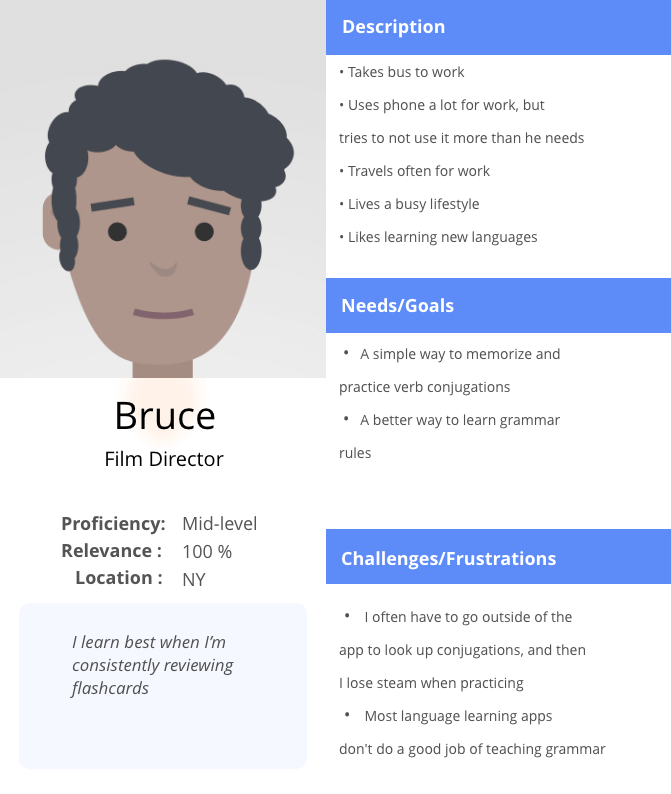
Persona
My hypothesis was turning out to be true, and I was learning that I wasn't alone in facing this grammar problem when studying languages on my own. Doesn't it feel good to be so seen?
Anyways! Next, I created a persona based on my target users, and the research findings from the interviews I conducted. I wanted to have a persona in place, so I could stay grounded as I was going through the design process, and use him as an anchor point when thinking through possible solutions.
Storyboarding, sketching, & ideas
Once I got the persona down, I started to think about the main features of the app. What should it include, and why? How should it look? Why? What is the architecture of the app? Why?
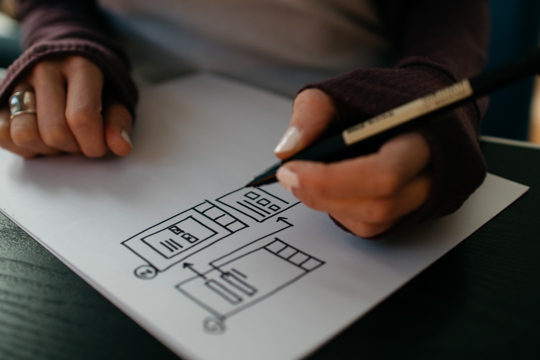
I started storyboarding, and drawing up whatever came to mind.
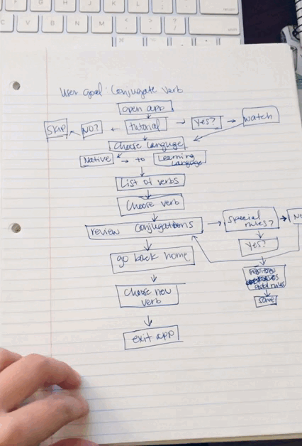
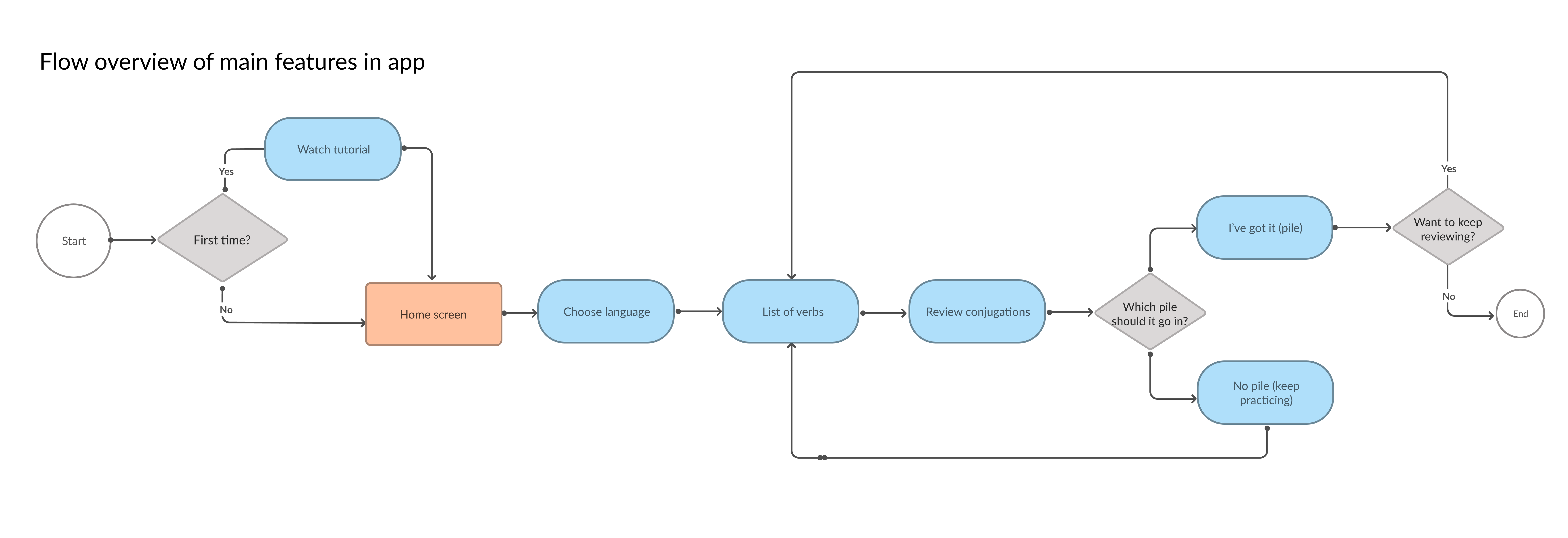
User flow
I finally landed with a flow that looks like this. This show represents the current overview for the application.
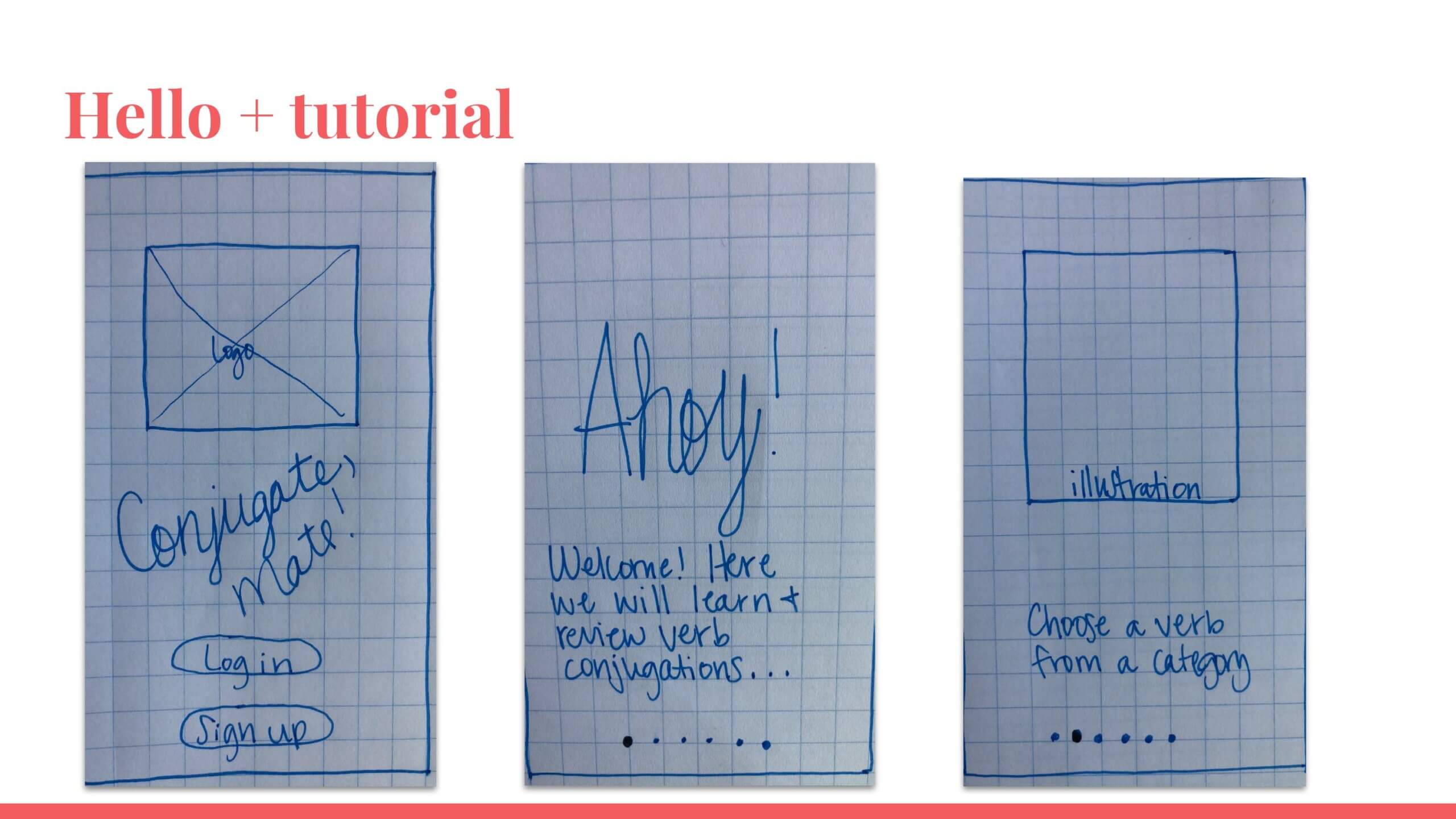
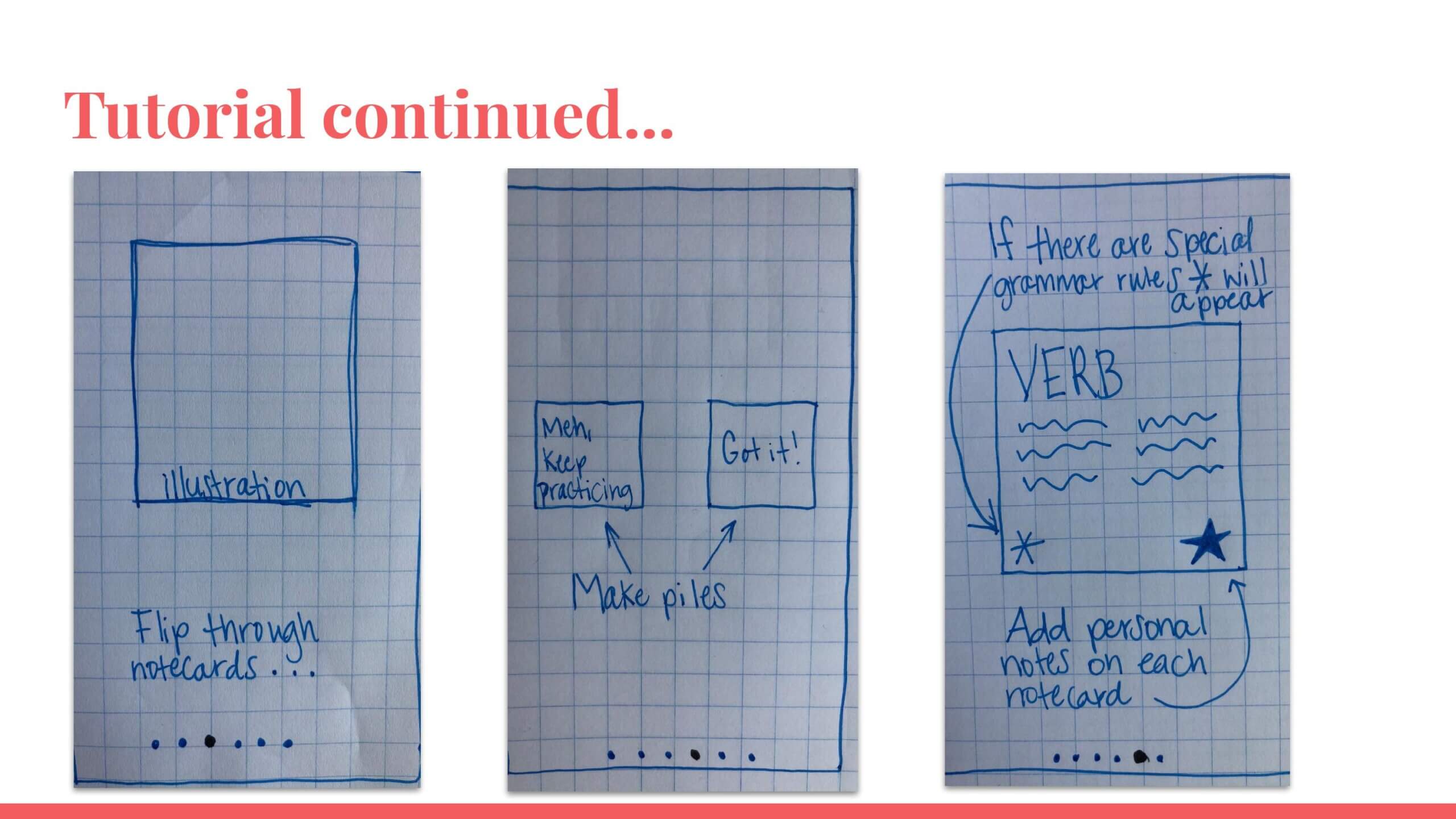
Prototyping
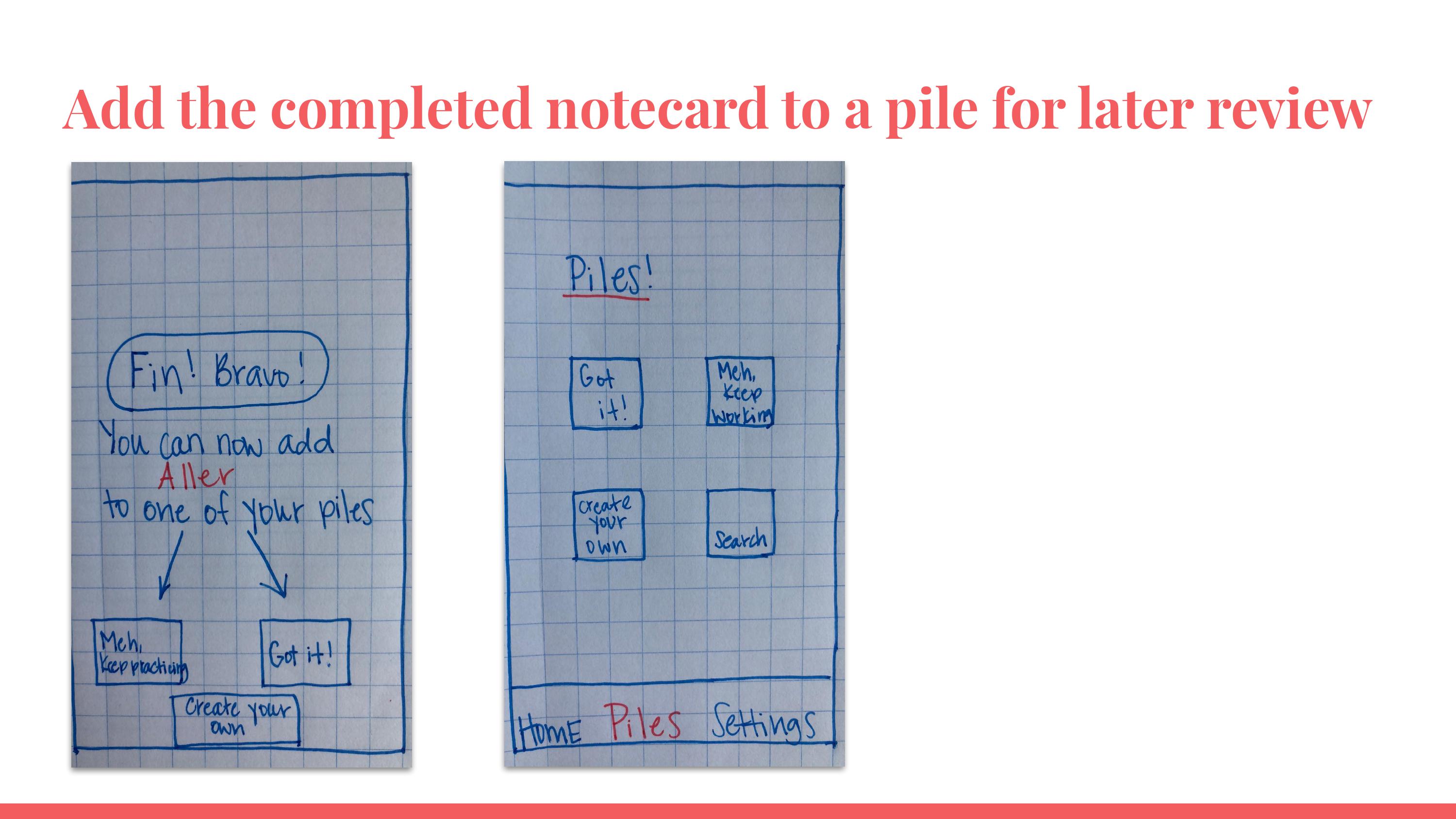
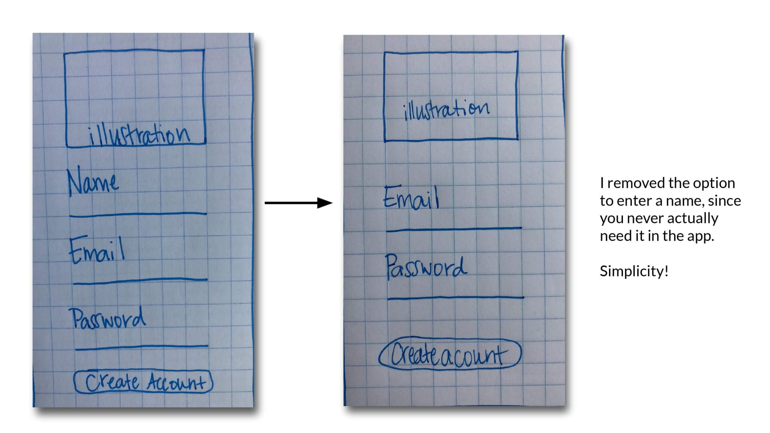
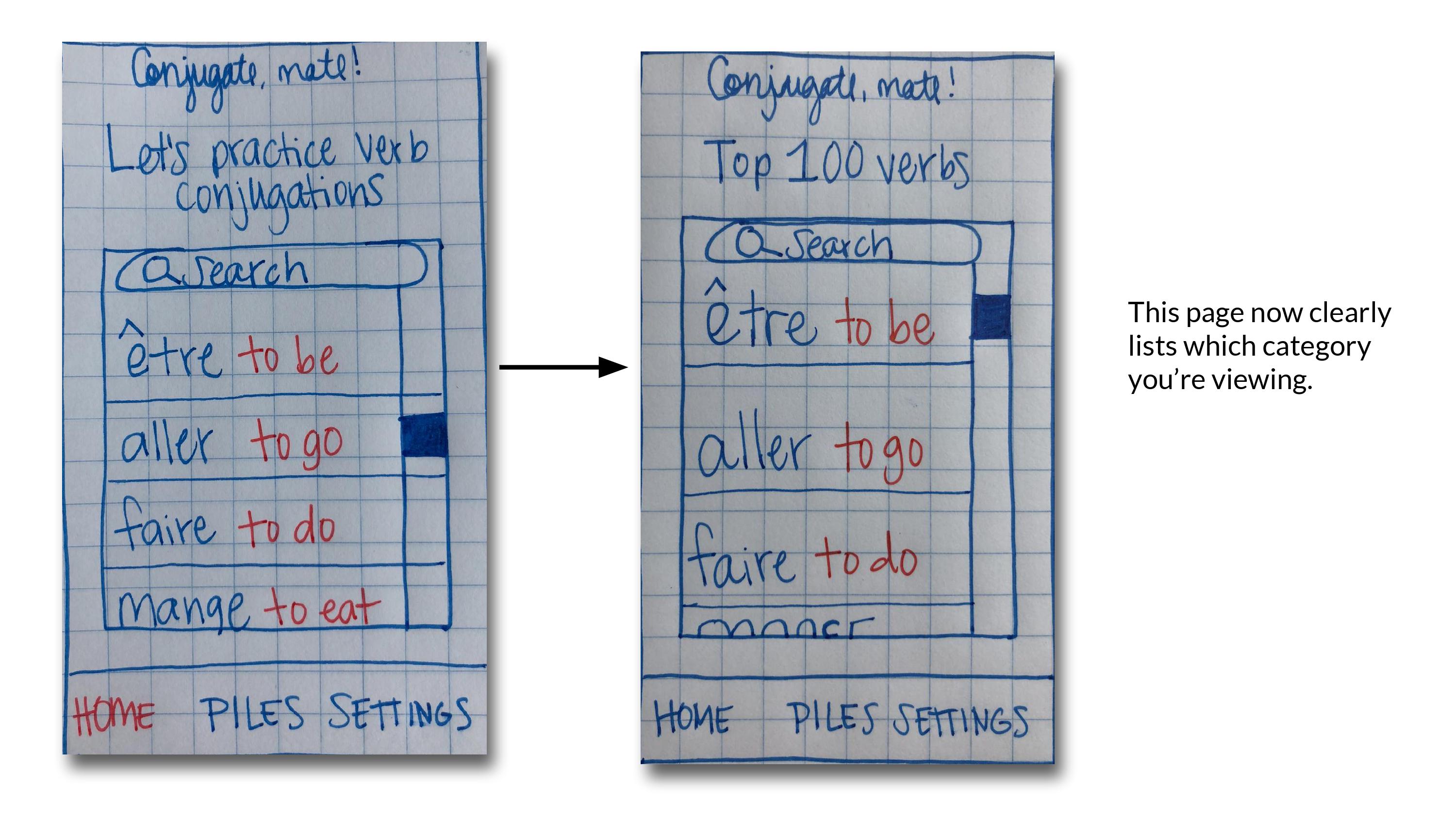
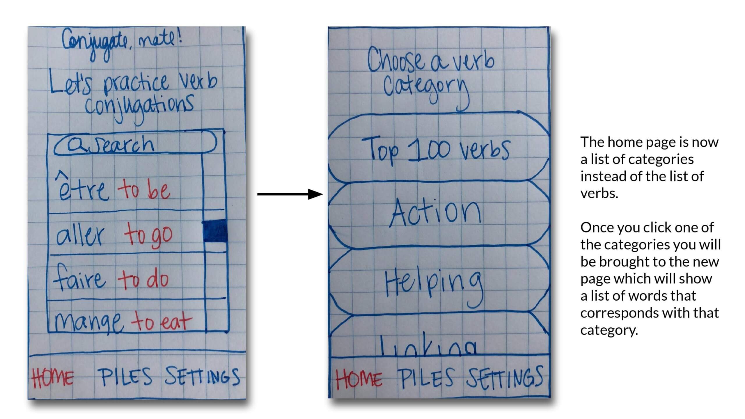
Since I now knew the overall architecture of the app, I started sketching with pen, and grid paper. These were the first round of prototypes. Looking back, I now see so many errors. For instance: how is a user supposed to go back in the app? *hint* they can't!
During the prototyping process, I referred back to my notes about the interviews, as well as checking in with my Bruce persona to make sure I was on the right track. I also wanted things to stay simple, and as close to real life as possible.
& this is why we test our designs...
As mentioned before, there were errors, but I didn't notice until I started testing, of course. Here's a link to the MarvelApp that I used for testing, so users could get a feel of how the pen+paper prototypes would behave in the real world.
This to me, represents perfectly the importance of the iterative design process, and why I advocate for it whenever I can. If we can "make these mistakes" early on, and catch them quickly, it will save time in the end. We will also have a better prototype to show to stakeholders earlier on, which everyone is happy about.
Have Fun!
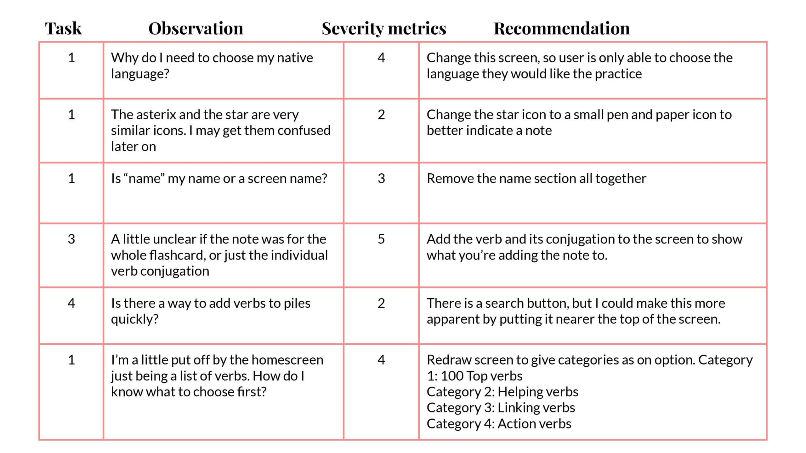
User testing
The next step in my iterative design process was to test. I once again was able to recruit test subjects that aligned with the user persona and my target audience. I received great feedback, and made changes accordingly.
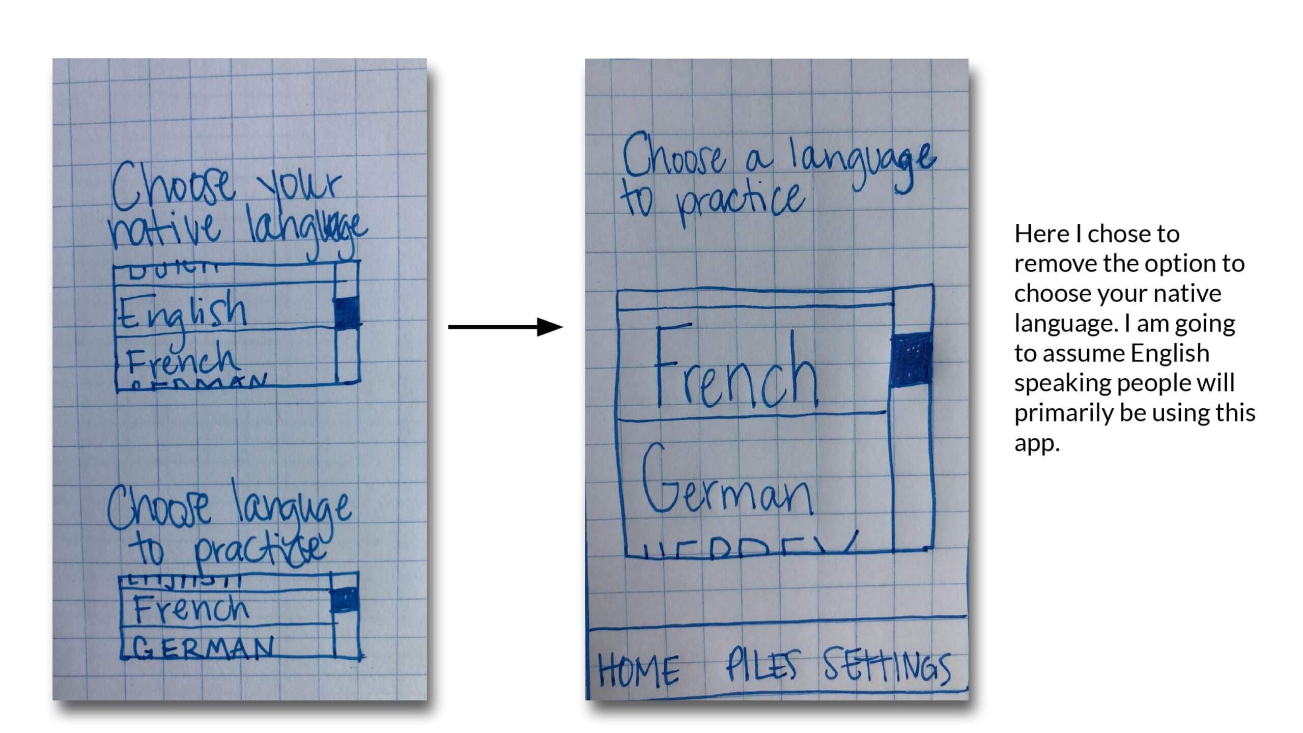
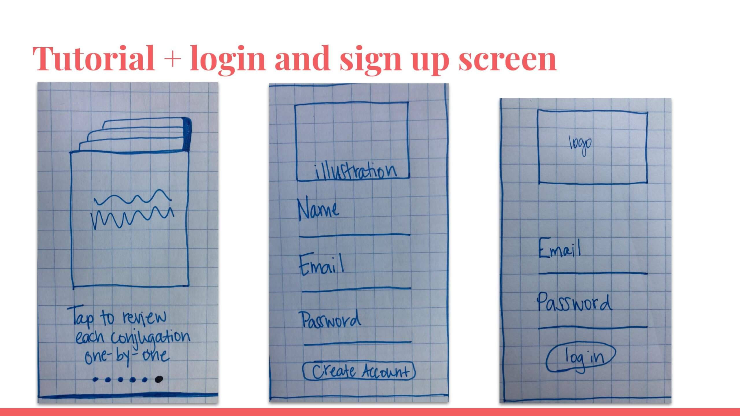
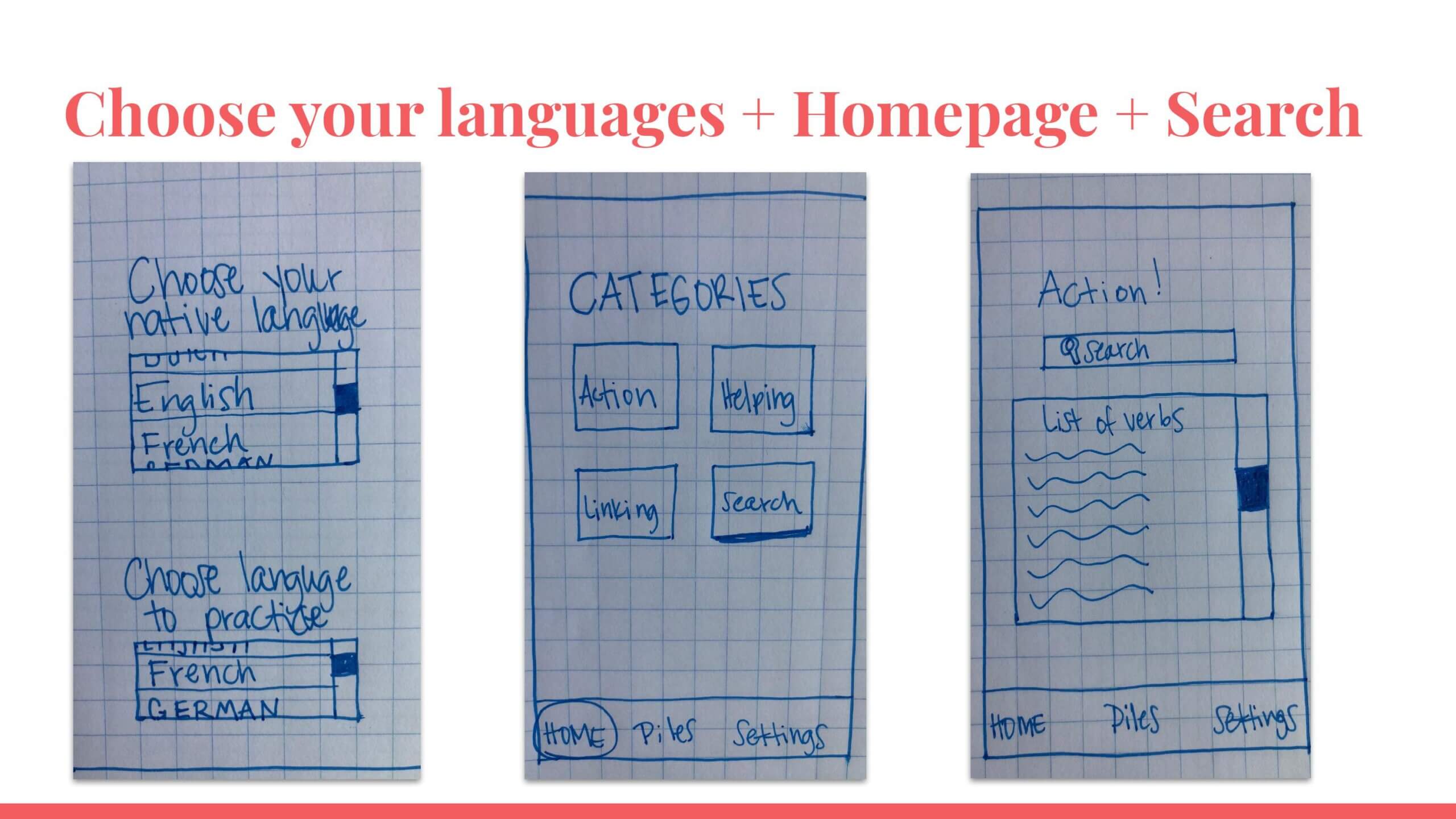
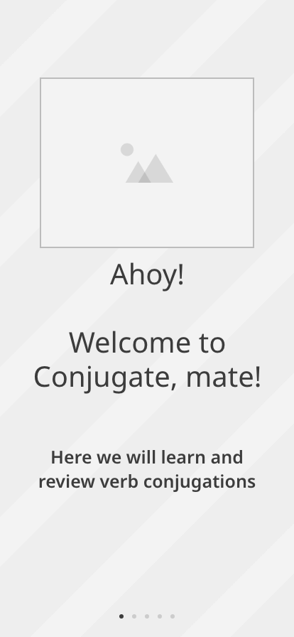
Wireframing
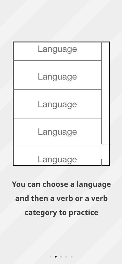
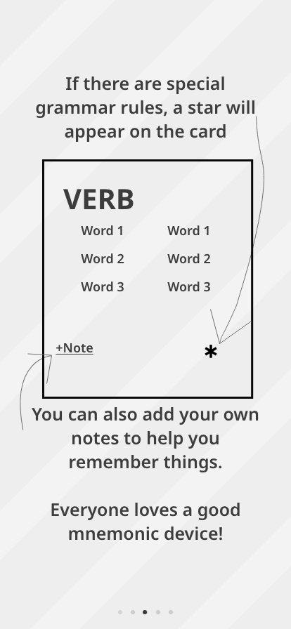
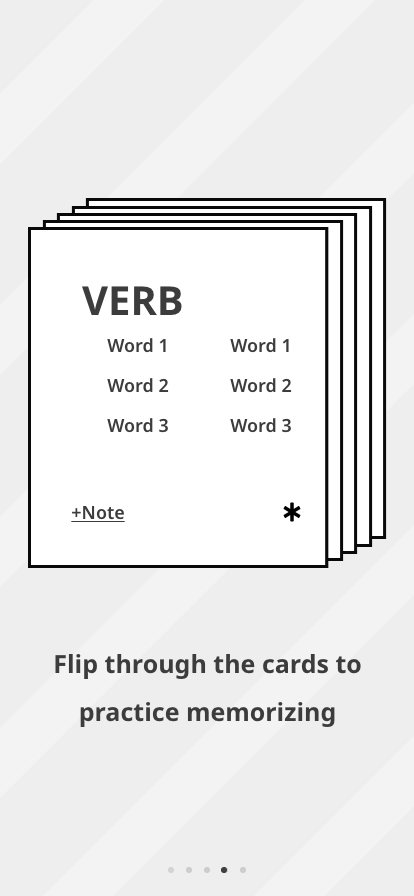
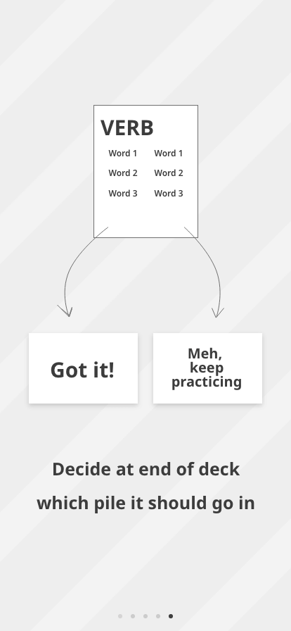
Up to this point, the testing has been fruitful, and the feedback insightful, therefore I started with the mid-level wireframes for the tutorial portion of the onboarding.
Next steps...
The next steps for this project are:
❋ do another round of usability testing
❋ create high-fidelity prototypes
❋ pitch to companies to add this flashcard
app as part of their existing applications

Conjugate, mate! aimed to meet the needs of the users, and the project. While this was a project for a design bootcamp, I treated it like a real-world project, by seeking out pain points in the market, and by keeping the project tailored to user's needs. In addition to fine-tuning hard design skills, I learned how to ask for specific design feedback, practiced iterating without attachment, and demonstrated critical thinking when I pivoted the functions.
Overall, I believe this project was successful, and could help current language learning apps if they were to implement this work into their current framework.
That's all for now, folks!
Thanks for stopping by
If you like what you see, please feel free to connect here, LinkedIn, email, or whatever... but please know that my preferred method is for you to send a carrier pigeon. 🕊️